A great thumbnail won't save a bad video BUT a bad thumbnail can ruin it.
Let's start with the examples to get your creative juices flowing!
Great Thumbnail Examples

Sometimes simplicity is all you need. Caitlin Bacher teaches entrepreneurs how to make 6-7 figures from their online course. All her videos include a picture of her on the right and a brand color with white text overlay on the left.

Gym Music. It’s easy to see what this channel is about: music and working out. Scantily-clad, muscle-bound models certainly catch your eye.
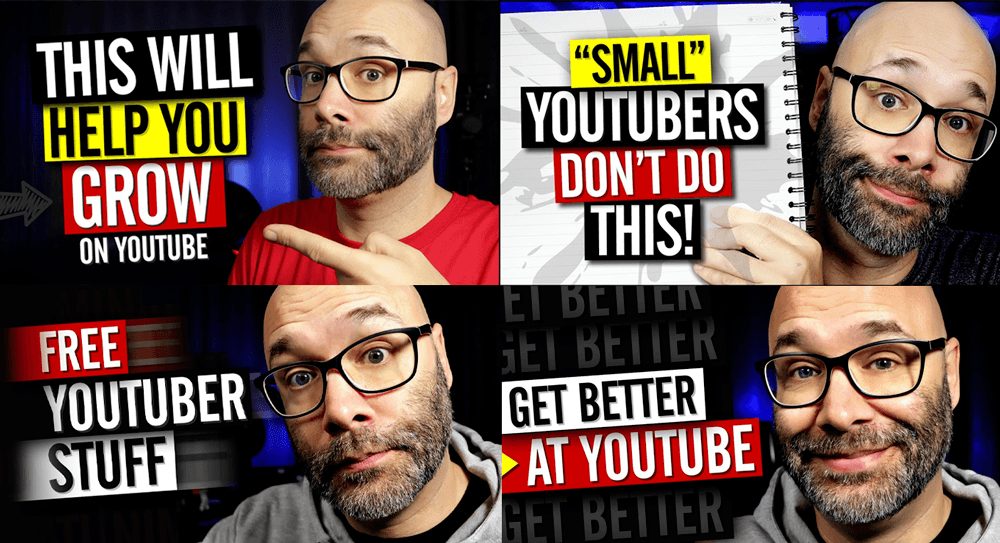
Nick Nimmin is one of my favorite “How to YouTube” instructors. Nick’s videos are always short, to the point, and entertaining. And so are his thumbnails. His standard is BIG text and color blocks.

Sunny Lenarduzzi teaches about Instagram and YouTube growth. She always has a crazy expression accompanied by a few words on her thumbnails. She went through a yellowish background stage with a cutout image, but it looks like she’s incorporating more of the actual background now.

Project Life Mastery talks about money and freedom. He changes the way his thumbnails look often but keeps his logo in the same place and his words to a minimum.
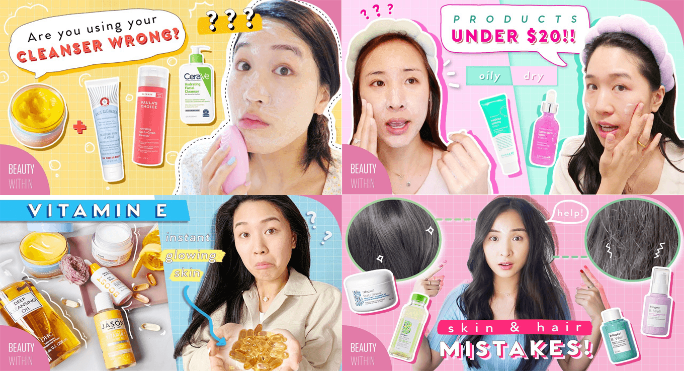
I chose to showcase Beauty Within because of her contrasting colors and crazy facial expressions. Her thumbnail is interesting enough that I would (did) click to see more.
For the final examples, I chose a random mix.
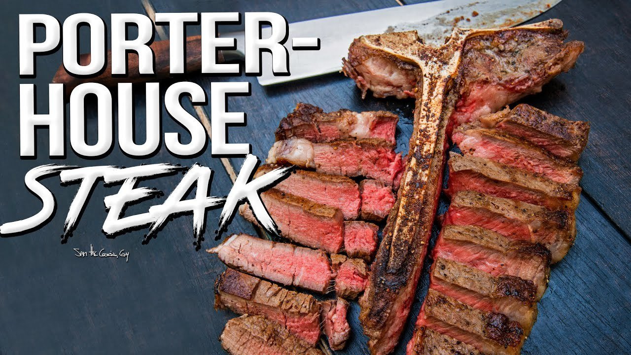
Just looking at this picture from Sam the Cooking Guy makes me want to click. YUM!

If you’re looking at how to attract money, you would probably click this just to see what’s up, right?

Looking to buy a house? Wouldn’t you want to know the “secrets,” especially if they are coming from a loan officer?

Finally, nothing beats a clean, straight-forward approach. Your picture with a great headline does the trick.
Tips for Awesome Thumbnails
Before you get started, keep these tips in mind. They’ll make your creation process easier and your conversions higher.
1. Show Your Face
If you notice, most of the YouTube thumbnails include faces. Not only smiley expressions but any emotional expression works. People are drawn to faces, especially close-up views.
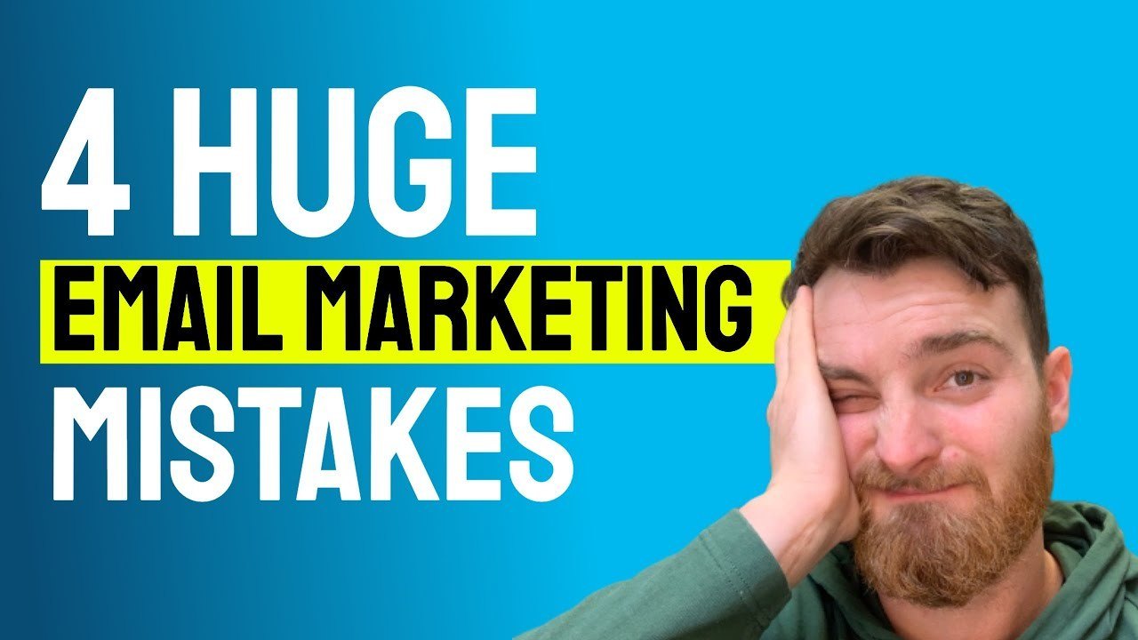
Plus, if you show a funky emotion on your face, people will be more likely to click to see why you look like that.
2. Choose the Right Colors
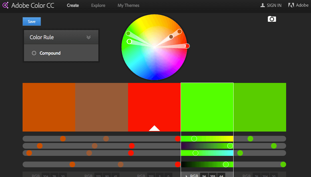
Choose colors wisely. You want to use complimentary colors instead of opposites. If you use strong colors like orange and green on black, you’ll repel people instead of attracting them.
Unless these are actually your brand colors. Check out Adobe Color CC and find great complimentary colors for your thumbnail designs.
3. Make It Easy to See on Small Devices
It goes without saying that if someone can’t see your thumbnail clearly, they won’t click. Think of a billboard. When you’re driving by at 60-70 mph, the text, images, and concept have to be clear to you, so you can take action.
YouTube thumbnails attract people to your video and make them click. Make the text and graphics easy to see and understand. The clearer your thumbnail is, the easier it is for people to see what you are talking about.
4. Limit Font Choices
There’s nothing I hate more than to see a graphic with 20 thousand different fonts. It’s so distracting. Use your brand fonts or at least use the same fonts in each YouTube thumbnail. You want people to see your thumbnail and know immediately that it’s you. If you've got some premium fonts that you've purchased, you can upload your fonts to Canva if that's your graphic design tool of choice. This helps keep everything consistent with your brand.
5. Use the Correct-sized Graphic

Have you seen YouTube thumbnails that don’t look quite right? Half of the text is missing or off-screen, or maybe the graphic is grainy? That comes from not using the correct-sized graphic.
Correct YouTube Thumbnail Dimensions in 2020
Be sure that your images are sized properly!
6. Focus on Channel/Site Consistency
When someone looks at your YouTube channel as a whole, you want them to see consistency. Look at these channels.
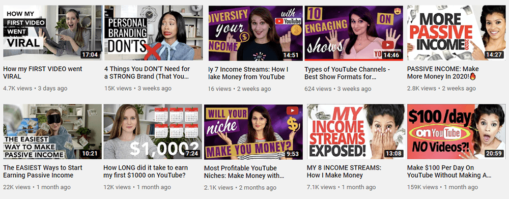
You can see how the channel page has an overall appeal. Each video is distinct and stands out on it’s own.
Consistency in your thumbnails is also a huge time saver. Instead of starting from scratch each time you make a new video, you will have a "paint by numbers" model that will save you time and effort and always look great.
7. Use Templates
You should start from scratch just once.
I made the mistake of trying to be creative and make original designs on every single thumbnail I made early on, and it was a HUGE net negative for me.
My designs were ok in a vacuum, but they didn't look good when you viewed them as a whole. They were all different, and when put side by side on my homepage, they looked chaotic.
Having a solid template provides consistency of design, and you'll get results with far less time and effort.
Simple + Consistent > Complex + Inconsistent
Spend time upfront on your template and you'll reap the benefits for years to come.
8. Use Less Text
"Make it simple, but significant."
Don Draper Fictional Cool Guy

You only need to use as much text as required to get people to click, which is usually just the headline. Too much text looks like mud when people are trying to decide whether or not to click.
Your title does NOT need to match your thumbnail verbatim.
The title is for the search engine and the person browsing, but the thumbnail is strictly for the person browsing.
9. Avoid "Burnt In" Overlays for Blog Post Thumbnails but Do Use on YouTube
This is a "do as I say, not as I do," tip.
You'll notice on my site here that I use a lot of text overlays directly on my thumbnails.
The text is part of the .PNG file itself.
I do this because I repurpose a lot of my blog posts as YouTube videos, and the text is far more important there than it is on a blog.
Tip: If you must use burnt on text, avoid using the entire title. Use as few words as possible to convey the topic. The title will still appear on your site so you don't need to be redundant and put it on the thumbnail in its entirity as well.
However, if you're not doing that, you should avoid this style like the plague.
- The visibility can be hard to manage (they'll look funny on mobile sometimes for example).
- They take far more time.
- They're easier to mess up.
- They restrict your flexibility down the road for bulk changes.
This style can look great, but you need to weigh the pros and the cons. Avoid spending your own time on this. If you insist on using this style, hire a designer if you can afford one.
10. Split Test Thumbnails
Your thumbnail images are part of your marketing strategy. Just like other marketing pieces, you need to split test to see what works best. Test to see which image, ratio of text-to-image, or white space works best in getting clicks.

The examples above showed that different thumbnails did much better than others for the same videos. I saw a 250% and 150% increase against the control thumbnails!
At scale, this can equate to thousands of additional views.
If you're curious, the tool Nate is using above is called Thumbnail Blaster. I'll mention it again toward the end of this post.
Bonus Tips
Compress Your Thumbnails
The thumbnail is one of the first things that will load on your page. If the file size is too large, it will slow the page and hurt your search rankings and bounce rates. Try to keep images below 300KB max if possible. Use a software like Tiny.PNG to compress images quickly before uploading to WordPress.
Create Your Thumbnail First
I've found that starting with my thumbnail before the content actually helps for some reason. This is especially true for YouTube where the thumbnail matters much more.
Get Feedback
Feedback is your friend. Remember, design is a skill that requires time, and we often don't realize how bad our work really is. Get an outside perspective before you commit to a style.
Be Exciting!
Whenever possible, use images that evoke a sense of intrigue. The purpose of the thumbnail is to get people to click and visit your page, so make that more attractive.
Recommended Resources
Canva
The industry standard for design. Easily create branded templates to use over and over.
Non Designers Design Book
The 80/20 of design. Read this book and you'll be better than the average bear at design fast. Just enough to get you going.
Snappa
Another Canva alternative. Snappa has a free and paid version. They offer pre-made templates, so you can create quickly and go. They also offer templates for other social media platforms.

