Great marketers know the power of color. Color is a powerful, but often overlooked, tool for drawing customers in and building brand recognition. Color psychology has long been studied, showing different hues can elicit different emotions in people. In this blog post, we'll look into how colors can be used in marketing to shape consumer behavior.
Blue

Blue: Calm, Reliable and Enticed.
Blue is a widely-used color in marketing, often associated with reliability and trustworthiness. It also has a calming effect, making it ideal for brands in healthcare and financial sectors. Big name companies such as IBM, HP, and Dell all use blue in their logos to convey an air of dependability and respect.
Red
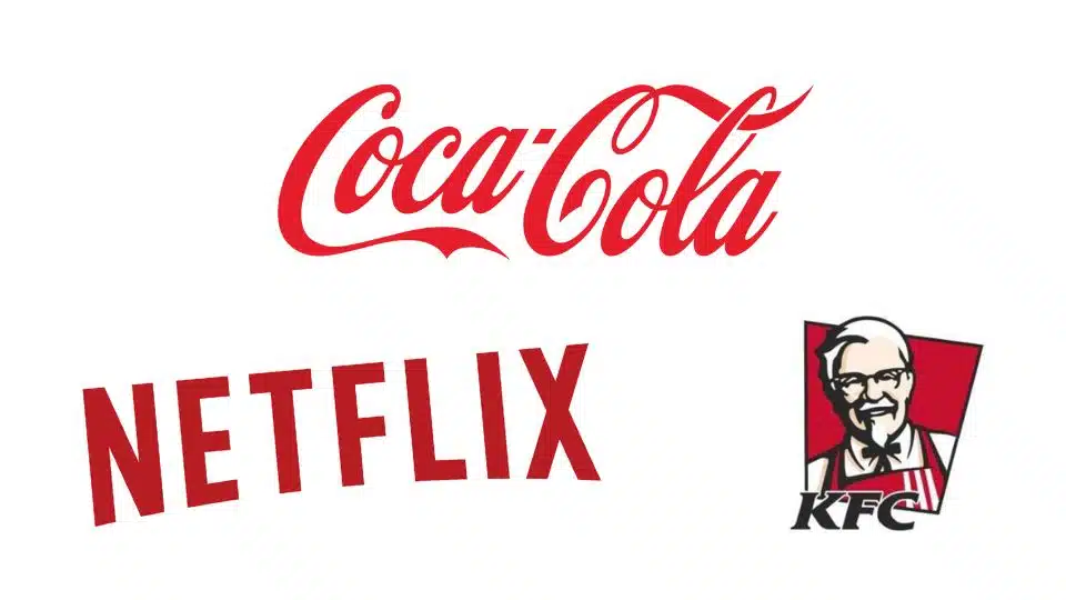
Red Color Psychology: Enthusiastic, Aggressive, Important
Red is an energetic color, often associated with passion and urgency. Its use in retail to elicit feelings of excitement or urgency has made red increasingly popular in brands like Coca-Cola, KFC, and Netflix that use red to convey a message of urgency and anticipation.
Orange
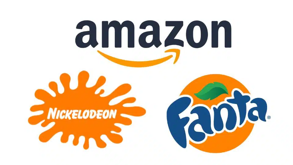
Orange Color Psychology: Fun, Energetic, Budget-Friendly
Orange is an energetic color that often conveys a playful atmosphere. Brands like Nickelodeon, Fanta, and Amazon all use orange in their branding for this purpose to convey fun and vibrancy.
Yellow
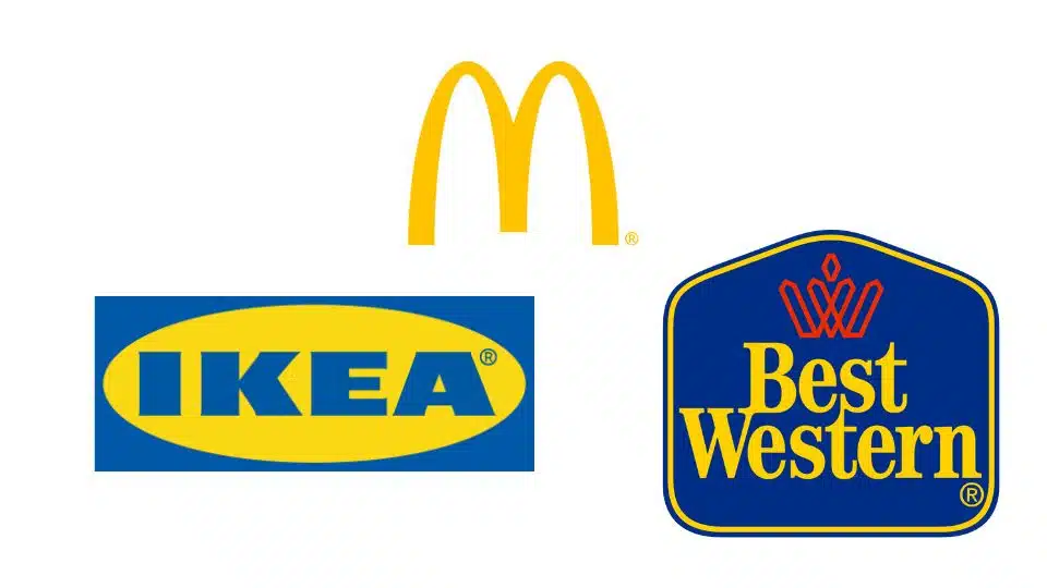
Yellow Color Psychology: Cheery and Friendly Warning
Yellow is an upbeat color, often associated with happiness and friendliness. It has become widely used to create a friendly atmosphere in food and hospitality industries such as McDonald's, IKEA, and Best Western - brands known for their friendly branding that invites customers in.
Green

Green Color Psychology: Ecological, Stable and Prosperous
Green is an uplifting color, often associated with nature, health, and wealth. It has become widely popular in both food and beverage industries as well as financial services firms like TD Bank that use green in their branding to convey a feeling of stability and abundance. Brands like Starbucks, Whole Foods and TD Bank all use green to convey these concepts.
Purple
Purple Color Psychology: Luxurious, Mysterious and Romantic
Purple is a luxurious color, often associated with luxury, mystery and romance. It has become widely used in the beauty and fashion industries to convey an air of sophistication and elegance. Brands such as Cadbury, Hallmark and, fittingly, the company Purple, all use purple in their branding to convey this luxurious yet romantic image.
Pink

Pink Color Psychology: Feminine, Young and Innocent.
Pink is often associated with femininity, youth, and innocence. It has become a staple color in the beauty, fashion, and toy industries alike; brands like Barbie, Victoria's Secret, and T-Mobile all utilize pink in their branding to convey this feminine vibe.
Brown

Brown Color Psychology: Earthy, Sturdy and Rustic
Brown is a color often associated with nature, stability and ruggedness. It has become widely popular in both food and beverage industries as well as outdoor adventure sports. Brands like Hershey's, Timberland, Cracker Barrel, The Cleveland Browns (duh) and UPS all use brown in their branding to convey an earthy and reliable image.
Black
Black Color Psychology: Strong, Sophisticated and Edgy
Black is an iconic color, often associated with power, sophistication and edginess. It has become particularly popular in fashion, luxury goods and technology brands such as Apple, Nike and Chanel who all utilize black in their branding to convey a powerful yet sophisticated message. Also, the blog EntreResource.com uses a black logo 🙂 Definitely worth checking them out!
White
White Color Psychology: Purifying, Virtuous, Healthier.
White is often associated with cleanliness, purity and health. Many brands use white in their custom logos as negative space or as variations of their main logo for contrast on dark modes in websites. These logos seem to do best when minimalistic.
Some brands, though, use it as the forefront for the brand. It has become popular in the healthcare and beauty industries alike; brands like Dove, Colgate and Apple (we used them as black earlier, but they alternative) all use white in their branding to convey a virtuous image.

