

Most advice on how to write product reviews is incomplete.
It tells you to “be honest,” “list the features,” and “share your experience.” That's fine if you're reviewing one gadget you bought for yourself. It breaks fast when you're running an affiliate site, covering multiple categories, updating comparison content, and trying to publish reviews that people trust enough to click and buy.
The bigger problem is that the web is full of thin review content now. A lot of it reads like the manufacturer page rewritten by AI. Same feature list. Same vague praise. Same empty verdict. Readers spot that immediately, and search engines are getting better at spotting it too.
The playbook that works is stricter. You need a decision framework, an evidence standard, a clean page structure, and full transparency about what you tested versus what you researched. That's how you write reviews that can rank, convert, and survive updates.
The Foundation of a High-Trust Review
Most product reviews fail before the writing starts.
They fail because the writer opens a blank doc, skims the product page, and starts summarizing features. That produces content, but not a review that helps someone decide. Buyers don't need a rewritten spec sheet. They need help choosing.
That matters because online reviews now sit directly in the buying path. One industry summary reports that 93% of customers read online reviews before buying, and 97% say reviews factor into their buying decisions according to Dixa's review statistics summary. If your page doesn't answer the decision questions quickly, you lose the reader.
Start with buyer intent, not product details
A strong review begins with the buyer's situation.
Someone searching for “best standing desk for small apartment” is not asking for a desk overview. They're asking whether the frame wobbles, whether the top size fits a tight room, whether cable management is decent, and whether setup is annoying. Someone searching for “ConvertKit review” usually wants to know if the automation builder is usable, whether the forms are flexible enough, and what kind of creator it suits.
Write down the questions behind the keyword before you research the product. That gives you a filter for everything else.
A practical framework looks like this:
- Problem first: What exact job is the buyer hiring this product to do?
- Constraints second: Budget, skill level, space, compatibility, speed, or team size.
- Decision blockers: What might stop the purchase?
- Alternatives: What would they buy if this one misses?
Choose criteria before you evaluate
If you create your criteria after you've already decided you like a product, the review turns into justification.
I've learned to lock criteria in early. For software, that usually means setup, usability, core workflow, reporting, integrations, support quality, and pricing clarity. For physical products, it might be build quality, ease of use, comfort, durability, maintenance, and value.
Practical rule: Decide what “good” looks like before you look for reasons to praise the product.
That one habit fixes a lot of bias.
It also helps you write balanced content. You're no longer asking, “How do I make this sound appealing?” You're asking, “How did it perform against the standard I set?”
Trust starts in the first paragraph
Your opening should establish three things fast:
- What the product is
- Who it's for
- How you evaluated it
If relevant, say whether the review is based on hands-on use, research synthesis, customer feedback analysis, or a mix. Readers appreciate clarity. They distrust ambiguity.
That's also where fake-review awareness matters. If you publish in ecommerce-heavy categories, it helps to understand the signals buyers already use to judge credibility. EntreResource has a useful guide on how to spot fake Amazon reviews that mirrors how readers think when they scan trust signals.
A review earns authority when it acts like a buying advisor. Not a cheerleader. Not a product brochure. Not a keyword trap.
Structuring Your Review for Readers and SEO
A high-converting review page is predictable in a good way.
Readers skim first. Search engines also need clean structure to understand the page. If your verdict is buried after 1,500 words of throat-clearing, most visitors won't reach it. I use an answer-first layout because it respects both the reader and the query.
Use a staged review structure
A strong review follows a staged method: define the review objective, specify evaluation criteria, compare the product against competitors, document findings, and end with a needs-based recommendation, as outlined in UXtweak's expert review guidance.
That framework works because it keeps the review from drifting into opinion soup.

The page anatomy I use most often
For affiliate reviews, I keep the front half tight and decision-focused.
| Section | What it needs to do |
|---|---|
| Quick verdict | State who should buy it, who shouldn't, and why |
| Who it's for | Qualify the reader fast |
| Key findings | Show how it performed on your chosen criteria |
| Pros and cons | Make trade-offs obvious |
| Alternatives | Prevent the page from feeling biased |
| Final recommendation | Map the product to specific user needs |
The quick verdict is the most underused section in review writing. Put the answer near the top. If someone searched “Ahrefs review,” they want the conclusion early, not after a long company-history intro.
Write for scan-first behavior
Most readers don't consume review pages linearly. They jump between headings, image captions, comparison tables, and the pros/cons section.
That means your formatting has to do work.
Use:
- Specific H2s and H3s: “Who This Is Best For” is stronger than “Overview”
- Short paragraphs: Dense blocks kill momentum
- Bullet points with substance: Not fluff summaries
- Tables where comparison matters: Especially for plans, versions, or use cases
- Screenshots and captions: Particularly for software and workflow tools
If you publish software reviews, screenshot best practices matter more than people think. A labeled screenshot of a dashboard, settings panel, or reporting view often communicates more trust than three paragraphs of description.
Put the verdict where skimmers can see it, then earn the long read with evidence.
Don't use a rigid template
A template helps. A formula hurts.
A mattress review, a Shopify app review, and a protein powder review shouldn't sound identical. The structure can stay stable while the emphasis shifts. For a SaaS tool, workflow friction might deserve the longest section. For a kitchen appliance, cleanup time and storage footprint may matter more than feature depth.
I also recommend a dedicated “Who should skip this” subsection when the product has obvious limitations. It disqualifies weak-fit buyers early, which improves trust and usually improves clicks from the right readers.
Search performance and conversion performance often improve from the same fix. Clear structure helps the crawler understand the page, and it helps the buyer find the answer.
Gathering Evidence and Demonstrating Proof
The old rule says you must personally use every product you review.
That's good advice in theory and unrealistic advice in affiliate publishing. If you cover web hosting, creator software, office gear, supplements, and Amazon tools, you won't personally own and test every SKU, every plan tier, and every variation. The core issue isn't whether you touched the product. The key point is whether the reader can see how you reached your conclusion.

Use a hierarchy of proof
Not all evidence carries the same weight. I treat review proof in layers.
At the top is original hands-on evidence. That includes your own photos, screenshots, setup notes, test outcomes, and side-by-side comparisons. For software, Loom clips, dashboard captures, and workflow walkthroughs are hard to fake well. For physical products, original photos that show scale, wear, packaging, and real-world use are more convincing than polished brand assets.
The next layer is structured external evidence. That includes verified customer feedback patterns, spec sheets, manuals, release notes, support docs, and competitor comparisons. If you're reviewing a TikTok Shop product category or creator-led ecommerce item, tools that help you scrape TikTok Shop reviews can make it easier to aggregate recurring buyer complaints and praise before you write.
Evidence-rich pages outperform vague ones
This isn't just a style preference. One review-marketing summary says product pages with user-generated content see a 161% lift in conversion, and adding customer photos can increase purchase likelihood by 137% according to Yotpo's review strategy summary.
The takeaway for writers is simple. Specific proof beats generic description.
A claim like “the espresso machine is easy to clean” is weak. A stronger version explains which parts detach, whether the drip tray overflows quickly, how often descaling is required, and what users complain about after regular use. The same principle applies to software. “Easy to use” means nothing unless you show what setup looks like and where friction appears.
How to write a credible review without hands-on access
At this stage, many affiliate sites either bluff or publish bland summaries. Neither works for long.
When I can't test personally, I switch from reviewer mode to research-journalist mode. That means I label the methodology and build the review from sources the reader can inspect conceptually, even if they don't see every raw note.
Use a process like this:
State the evidence type clearly
Tell readers whether the review is based on research, customer feedback synthesis, product documentation, or limited testing.Collect recurring patterns, not isolated opinions
One angry review doesn't define a product. Repeated complaints about battery fade, shipping damage, or confusing onboarding do.Map claims back to criteria
Don't gather random facts. Gather evidence that answers the buying questions you defined earlier.Separate facts from judgment
Specs are facts. Your conclusion about value is judgment.
If you haven't used the product, don't pretend you have. Explain your method and make the method strong.
Here's a useful walkthrough on getting free products for review if you're trying to increase your share of hands-on coverage over time. That won't solve every access problem, but it helps.
A short visual demo often helps readers understand what “proof” should look like on the page:
What weak proof looks like
Weak review pages tend to share the same signs:
- Feature parroting: The copy mirrors the sales page
- No decision context: You can't tell who the product suits
- No trade-offs: Every section sounds positive
- No comparison point: The product exists in a vacuum
- No evidence labels: Readers can't tell what was tested versus researched
That's where low-effort AI content stands out for the wrong reasons. It can summarize. It usually can't observe.
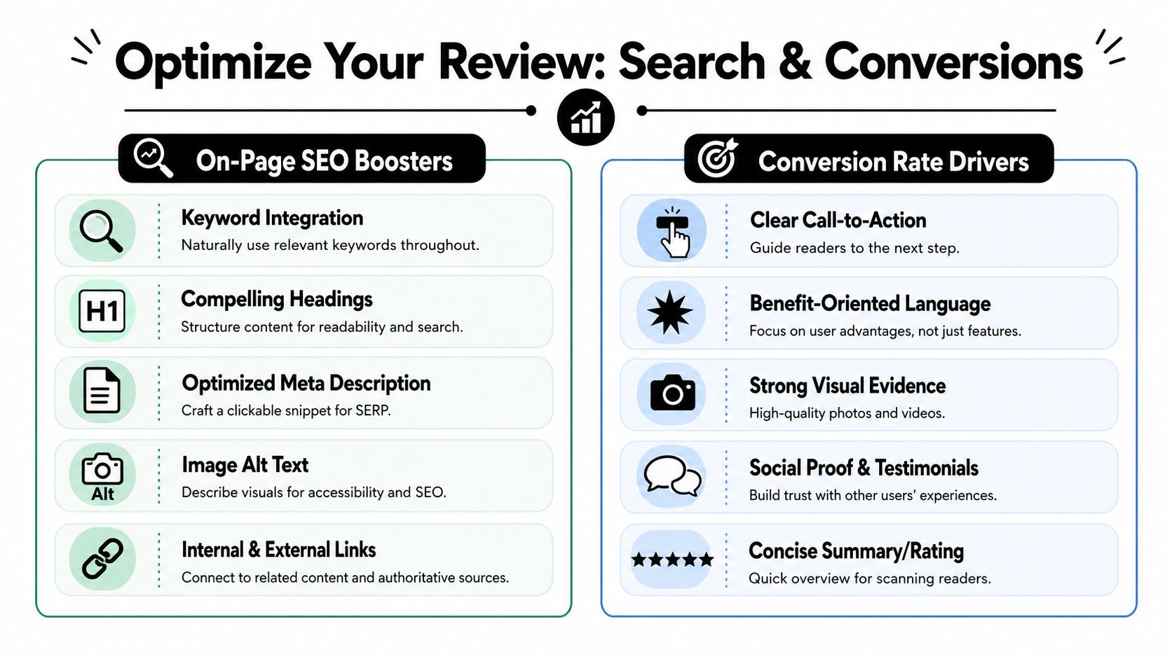
Optimizing Your Review for Search and Conversions
A solid review can still underperform if the page doesn't package the information well.
Search and conversion work together here. The same changes that help a page win the click often help a buyer make the decision once they land. You don't need gimmicks. You need relevance, clarity, and friction reduction.
Build the page around click intent
Your headline should match the search intent tightly. “Notion Review for Content Teams” is stronger than “My Honest Thoughts on Notion” if the query is commercial and category-specific. The same goes for your meta description. It should preview the decision value of the page, not summarize your personality.
The opening screen should carry the page.
That usually means:
- a quick summary box
- a clear recommendation
- one CTA for ready buyers
- one jump link for people who want the full analysis
Use keywords where readers expect them
When people ask how to write product reviews for SEO, they usually overfocus on keyword repetition. That's the wrong level.
Use the primary phrase in obvious places if it fits naturally: title, intro, one subheading, meta description, and image alt text where relevant. Then support it with terms buyers use, such as “pricing,” “alternatives,” “setup,” “performance,” “pros and cons,” or the exact model name.
I also like using “best for” language because it aligns with how real users filter options:
- best for beginners
- best for apartment use
- best for agencies
- best for low-maintenance skincare
- not ideal for advanced editing
That language improves clarity and often captures useful long-tail intent without sounding forced.
Conversion comes from reducing uncertainty
Most affiliate CTAs fail because they ask for the click before removing enough doubt.
A review converts better when the reader can answer these questions quickly:
| Buyer question | On-page element that helps |
|---|---|
| Is this for someone like me? | Buyer-fit summary |
| What are the trade-offs? | Honest pros and cons |
| How does it compare? | Alternatives block or comparison table |
| Why should I trust this page? | Methodology note and proof |
| What do I do next? | Clear CTA near moments of certainty |
If you use scorecards, keep them consistent. Don't give one product a high “ease of use” score because setup was fine, then judge another on documentation depth. Readers may not audit your method line by line, but they notice inconsistency.
Working standard: Every CTA should sit next to the reason someone would click it.
That might be a pricing note, a “best for” qualifier, a key upside, or a brief warning. Buttons without context often get ignored.
A few practical CRO choices that help
I don't like overdesigned review pages. They usually distract from the buying decision. Clean beats clever.
What tends to work:
- Sticky summary boxes: Useful on long reviews, especially on mobile
- Comparison tables near the top: Better for buyers still choosing between products
- Repeated CTAs with different intent levels: “Check price,” “See demo,” “Compare alternatives”
- Visual proof near claims: Screenshots next to usability comments, photos next to build-quality claims
- One rating philosophy: Either category scores plus verdict, or no numeric score at all
If you need a lightweight platform that mixes tutorials, reviews, and comparisons in one content stack, EntreResource is one example of a publisher model built around that format. The useful takeaway isn't the brand. It's the structure. Review content performs better when it's connected to adjacent how-to and comparison pages instead of sitting alone.
Navigating Disclosures and AI Transparency
Most affiliates still treat disclosure like legal fine print.
That's backward. In review publishing, transparency is a trust signal. Readers already know affiliate links exist. What damages trust is trying to hide them, soft-pedal them, or disguise AI-assisted writing as hands-on experience.

Put the disclosure where readers can actually see it
A good affiliate disclosure is plain language, placed near the top, and specific enough that nobody has to interpret it.
Something like this works well in practice:
This review contains affiliate links. If you buy through them, I may earn a commission at no extra cost to you. That doesn't change how products are evaluated.
That statement won't kill conversions if the review is useful. Weak reviews blame disclosure for poor performance when the actual problem is lack of trust.
AI disclosure is becoming part of review hygiene
Recent guidance on review writing increasingly emphasizes specificity and proof, including brand and model details, measurements, and scenario-based evidence, especially as a way to stand apart from formulaic AI-generated content, as discussed in Affilorama's writing guide.
The practical issue isn't whether you used AI at all. Many teams do. The issue is what AI was allowed to do.
My rule is simple:
- Fine for AI use: outlining, rewriting awkward sentences, summarizing raw notes
- Not fine without verification: inventing product experience, generating specs from memory, claiming direct testing you didn't perform
If you use browsing or automation tools to gather review evidence at scale, make that process auditable. For example, a tool like an intelligent browser agent can help collect structured page data and public product information, but it still doesn't replace human judgment, source checking, or an explicit methodology note.
Radical transparency is a competitive advantage
Readers are getting better at detecting synthetic review language. So are editors. So are platforms.
You can turn that into an advantage by labeling your process in plain English:
- tested hands-on
- researched from docs and customer feedback
- updated after version changes
- screenshots captured by the publisher
- pricing checked on a specific date if you include pricing at all
A clean disclosure and a short methodology note make the page feel more trustworthy, not less. That's especially true when you couldn't test the product directly. Ambiguity creates suspicion. Clear limits create credibility.
Product Review FAQ
How long should a product review be?
As long as it needs to be to answer the buying question.
A review for a simple phone stand can be short if the decision hinges on stability, footprint, and price positioning. A review for email software, a standing desk frame, or an all-in-one laser printer needs more room because the buyer is evaluating more trade-offs.
I use this practical test: if a reader can finish the page and still not know who the product is for, the review is too short. If the page repeats the same point three ways, it's too long.
Can you write a product review without using the product yourself?
Yes, but only if you make the methodology explicit and keep the claims within the evidence.
This is one of the biggest gaps in mainstream advice. Most templates assume direct usage. Amazon Pay's review guidance points in a more useful direction by implying that trust comes from being honest and specific, comparing against competing products, and explaining how judgments were reached, which is covered in Amazon Pay's review-writing guidance.
That means a non-hands-on review can still be credible if you:
- label it as research-based
- compare it against relevant alternatives
- use verified customer feedback patterns
- avoid first-person experience claims
- explain why you reached the verdict
How do you ask brands for review units if your site is still small?
Lead with relevance, not audience size.
A short outreach email works better than a long pitch deck. Tell the brand what page you're creating, who it's for, how you evaluate products, and what you need. If you already have adjacent content in the same niche, link that. Brands care whether your audience is qualified and whether your review process is serious.
Keep the ask simple:
- a sample unit
- temporary software access
- a media kit
- updated specs or assets
- clarification on feature differences between models
If they say no, write the review from research and revisit later.
Should every review include alternatives?
Almost always, yes.
A page with no alternatives often reads like a sales page. Even if one product is your preferred pick, readers want context. Alternatives also help you retain the visitor when the main product isn't a fit.
I usually include:
- one cheaper option
- one better option for advanced users
- one competitor with a different strength
That framing is more useful than dumping five random competitors into a list.
How often should you update product reviews?
Update them when the buying decision could change.
For software, that could be after major interface changes, pricing changes, integrations, or policy updates. For physical goods, updates matter when models change, quality shifts, availability changes, or customer feedback patterns move in a clear direction.
At minimum, review your top money pages on a schedule. Check screenshots, version references, pros and cons, and alternatives. Old review pages often don't die because the topic got worse. They die because the content stopped matching reality.
What's the difference between a single review and a roundup post?
A single review answers, “Should I buy this product?”
A roundup answers, “Which of these products should I buy?”
Use a single review when the product has enough brand demand or when you need depth. Use a roundup when the buyer is early in the comparison phase and hasn't chosen a product family yet. The strongest affiliate sites usually use both, then link them together so readers can move between deep analysis and broad comparison.
Writing strong reviews isn't about sounding enthusiastic. It's about making the decision easier.
If you remember one rule, make it this: show your method, show your evidence, and make the trade-offs obvious. That works whether you tested the product yourself or built the review from rigorous research. It also happens to be the fastest way to stand apart from the flood of low-effort AI review content.