Screenshots are an awesome way to improve your blog posts. The uses are basically limitless and using them can be helpful in any niche.
You can use screenshots to boost clarity in tutorials or "how to" type posts.
You can showcase great reviews left by customers via social media, email etc. The possibilities are endless.
Using them is pretty straightforward, but there are a few things you should know if you want to get the most out of them.
#1 Zoom In (Less Is More)
Depending on the size of your device, the screenshot that you take can appear quite different when you add it to your content.
Here's an example of a screen that I wanted to use for a tutorial on promoting affiliate products with ClickBank. This is what the screen shot would look like if I took it without zooming.

Bad screenshot with way too much white space and difficult to read text.
That's pretty painful on the eyes. Theres a lot of white space there and the reader would have to zoom in on their own to really get a good look at this.
Here's how the image would look after I've zoomed in on it.

Better...Zoomed in for capture and then cropped afterwards for clarity.
Notice that I also cropped out the unnecessary parts above that were just distracting.
Much easier on the eyes, right?
Another thing to remember, do the zoom before taking the screenshot, not after.
Cropping and zooming after the image has been captured can wreck the resolution of the image and make it look low quality.
Here is what the original image (small text, tons of white space) would look like if I cropped it as it was.

Example of how resolution is lost if you crop from a large image. Always zoom in on the element and then crop afterwards in order to maintain the highest resolution possible.
Compare that image to the one right above it and you'll notice that some resolution is lost (although in this example it isn't a truly noticeable amount).
It's not a huge deal in most circumstances, but if the image quality is more important, it can have a big impact, especially on larger devices.
#2 Use Annotations
Adding text, arrows, magnification effects etc. can make screenshots more effective.
I've yet to see a screenshot software that doesn't provide at least the ability to add text over images.

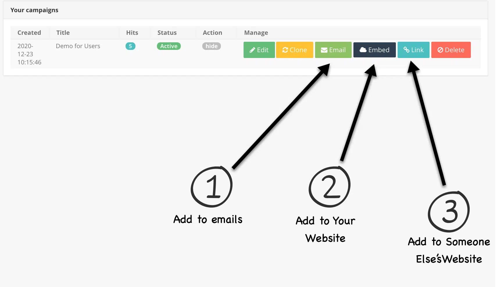
Example showing how adding annotations to aid in clarity.
The example above combines text, arrows and numbers to add clarity to an image I used to showcase a software I sell.
For that example, I used a software called "Snagit" to add the annotations.
If you really want to get sexy with it, you could accomplish this same effect with a tablet. Using your actual handwriting on an image adds a nice element of personality and uniqueness to your content.
I've enjoyed using an iPad Pro and Apple Pencil for annotating PDFs and other documents but there are much more affordable options available as well.
#3 Resize and Compress Images
Screenshots can end up being very large files. It's a common blogging best practice to keep image file sizes as small as possible without damaging resolution in a noticeable way.
For me, I try to keep all images below 500KB. 500KB is the absolute max and a typical image is closer to 100KB or below.
There are two things to do in order to make images the proper sizes in terms of dimensions and actual file size.
First, we should resize large images manually.
Many screenshots are way bigger in terms of actual pixel height and length, not just file size, than they need to be for a blog post.
What is the right size? The rule of thumb is to not make your images wider than the maximum content area width.
If your blog content area is 800px wide, you don't need to have images that are any wider than 800px.
The only reason you'd want larger images than that would be if you plan on having an "open full size image on click" option (which I do typically).
Yes, as we've mentioned already, it's always better to have an image that is too big and then reduce it than have an image that is too small and expand it.
Resizing images is very easy and requires no special tools.
Simply open the image file > choose "Tools" > choose "Adjust Size"
Make sure that you check the box to keep proportions in tact. You can now adjust the file dimensions.

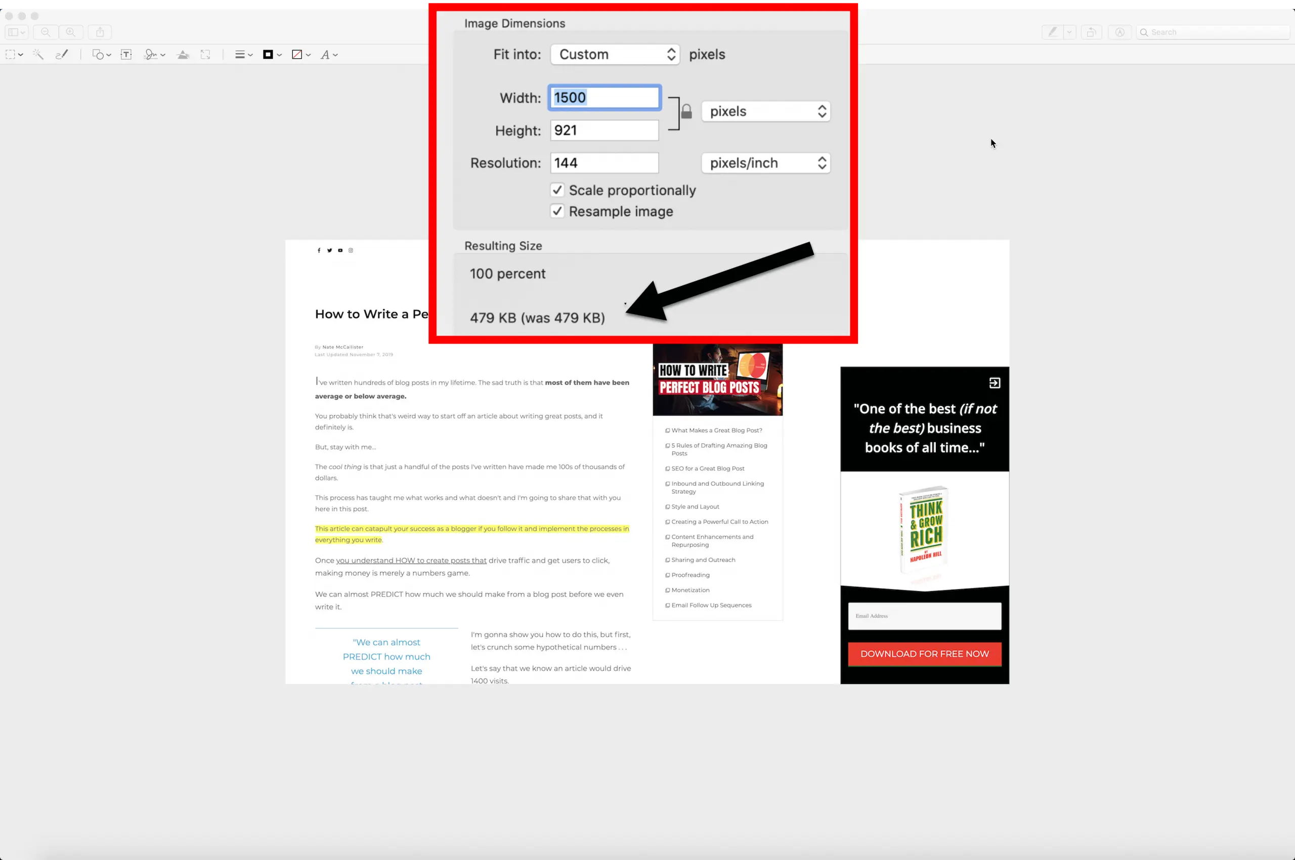
Dimensions are way too large and the file size is 1MB too big!
We can fix the large image above very quickly.

Resizing the images trimmed nearly a full MB off the file size. Keeping this at 1500px width will ensure the image looks good when viewers click "open full size image on click" but is also wider than I'd need to fill my blog's content area width.
Once we've adjusted the physical size, it's time to adjust the file size. I use a tool called tiny.png (free) to compress images quickly.

I was able to get the file that was originally 1.4MB down to 111KB without losing any resolution. .
#4 Use "Open Full Size on Click" Occasionally
Sometimes an image has a good bit of detail and the smaller screen views don't give it justice.
In these cases, I like to use the "open full size image on click" option.

This is a feature that allows the user to see a bigger, more isolated version of the image when they click on it while on desktop or tablet (it doesn't serve much value for mobile).
The only drawback is that you can't include links to the images if you want to open them full size on click. I try to choose this option every time I have an image that doesn't need an outbound click.
#5 Use Shadows and Borders for Separation from Website
Screenshots can blend into your blog posts which isn't what we want. We want to make it clear that they are images and not our own blog text.
The best way to make images stand out is to use effects like borders or shadows.
Scrolling through this blog post will show you exactly what I'm talking about. Adding these image effects is very easy in most WordPress softwares. I use Thrive Themes if you're curious.
#6 Combinations for Clarity
There are no rules. The only goal is clarity. To make things as clear as possible, sometimes I combine multiple screenshots into one image.

Example of how I combine separate screenshots into one image for maximum clarity.
The example above shows what happens when someone clicks the "Ranked Tags" button. I couldn't capture this in one image so I simply took two screenshots, pasted one into the original and added annotations explaining what was happening.
Additional Resources
- How to Take a Screenshot on Any Device
- Top 9 Best Free Screenshot Softwares
- Snagit (the program I use)
- 10 Tips on Best Image Size for Your Blog
- Tiny.Png - Free software I use to compress image files

