

You've spent money on ads, published the blog post, mailed your list, or promoted the offer on social. Then people click, land on the page, skim for a few seconds, and leave. That's the frustrating part of funnel building. Traffic feels expensive because it is. Waste enough of it and even a strong offer starts looking broken.
A landing page usually isn't failing because the button color is wrong or the page isn't “modern” enough. It fails because the message is fuzzy, the next step isn't obvious, or the page asks for trust before it earns it. If you need a quick refresher on what is a landing page, think of it as a single-purpose page built to move one visitor toward one action.
That focus matters more than is commonly believed. A broad benchmark from industry stats shows only the top 25% of landing pages reach a conversion rate of 5% or higher, and double-digit conversion rates are considered elite performance according to industry landing page statistics compiled by Involve.me. In other words, average pages leak attention fast.
At EntreResource, we treat landing page best practices like a priority stack, not a design trend list. Entrepreneurs, affiliate marketers, and course creators don't need prettier pages. They need pages that make revenue easier to earn. These are the ten practices I'd fix first.
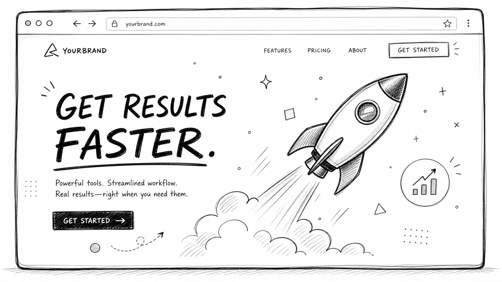
1. Clear Value Proposition Above the Fold
If the first screen doesn't answer “What is this, who is it for, and why should I care?” the rest of the page won't save you.
Visitors often decide within about five seconds whether a page feels relevant, and modern guidance emphasizes above-the-fold clarity and message match with the ad or email that brought them there, according to Framer's overview of landing page best practices. That tracks with what I've seen in real campaigns. When the headline is vague, bounce behavior follows quickly.
Backlinko does this well with a category-defining promise. Sumo does it with simple business-growth language. ConvertKit speaks directly to creators. Different markets, same principle. The headline leads with the outcome, not with internal brand language.
What strong hero copy looks like
A strong value proposition usually has three parts:
- Specific audience: “For Amazon FBA sellers,” “for creators,” or “for affiliate sites,” not “for everyone.”
- Clear outcome: More subscribers, better-qualified leads, faster setup, less manual work.
- Reason to believe: A method, format, advantage, or differentiator that explains why your offer is worth attention.
Weak version: “Grow your business with better tools.”
Stronger version: “Build an affiliate content system that turns review traffic into email subscribers and buyers.”
Practical rule: If your visitor can't repeat your offer back in one sentence after one glance, rewrite the hero.
I usually test a few headline angles before scaling traffic. One benefit-led version, one problem-led version, and one message-matched version pulled almost directly from the ad or email subject line. Clever headlines lose to relevant headlines more often than people want to admit.
2. Single Primary Call to Action with Strategic Placement
Most landing pages ask the visitor to make too many decisions. Subscribe. Book a call. Watch a demo. Read reviews. Browse features. Follow on social. That isn't flexibility. It's friction.
A page needs one primary action. If the goal is newsletter signups, every major visual cue should support the signup. If the goal is booking a demo, stop offering three softer alternatives above the fold. One page, one job.

Drift's “See Demo” style pages are a good model. Stripe is also disciplined about moving users through one primary action at a time. Notion often keeps referral and acquisition pages pointed at a single obvious next step.
Where to place the CTA
You don't need one button. You need one primary CTA repeated in the right places.
- Top of page: Catch high-intent visitors immediately.
- After core benefits: Let skimmers decide once they understand the value.
- Near proof or objection handling: Give people a next step when trust increases.
Button copy matters more than people think. “Submit” is weak. “Get Access,” “Start Free,” “Download the Checklist,” and “Join the Weekly 5” tell the visitor what happens next.
I also like pairing the button with short supporting microcopy. “Get the checklist.” Then under it, a clarifier like “Immediate access. No fluff.” That second line often does quiet conversion work because it reduces uncertainty without asking the visitor to read another paragraph.
3. Mobile First Responsive Design
A page that looks polished on desktop can still be painful on a phone. That's where a lot of conversions disappear.
Modern landing page best practices evolved away from brochure-style pages toward mobile-first, experiment-driven pages built around behavioral data, device responsiveness, and continuous testing, as summarized earlier from the Framer guidance. That's why I build for the small screen first, then expand up. It forces cleaner priorities.
A few common mobile mistakes show up over and over. Hero images push the CTA too far down. Form fields are annoying to tap. Text blocks feel endless. Pop-ups cover the entire screen. Pages technically “respond,” but they don't convert.
What I check on real devices
I don't trust browser preview alone. I open the page on an iPhone, an Android phone, and a tablet if the campaign matters.
- Thumb reach: Can someone tap the CTA comfortably without zooming or hunting?
- Readability: Does the headline still make sense in two or three short lines?
- Form friction: Do email and phone fields trigger the right mobile keyboard?
- Content trimming: Are sidebars, extra links, and decorative blocks removed on mobile?
- Load feel: Does the page feel fast enough to keep moving?
Mobile design is not “desktop shrunk down.” It's a different buying environment with less patience and less space.
For entrepreneurs and creators, mobile is often first-touch traffic from social, email, or paid placements. If your page buries the promise under oversized media or long setup copy, people won't wait for the payoff.
4. Social Proof and Trust Signals
Cold traffic is skeptical. It should be. Your page has to answer the silent question: why should I believe you?
That's where proof earns its keep. Testimonials, recognizable client logos, review snippets, screenshots, and simple trust cues reduce hesitation. I don't mean stuffing the page with random praise. I mean showing evidence that supports the exact claim you're making.
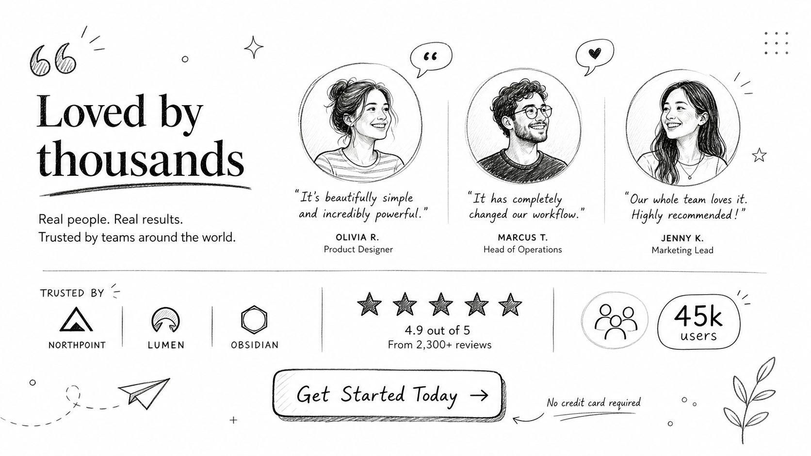
If you sell a course, a testimonial should mention implementation and outcome. If you promote a software tool as an affiliate, show proof from real users of the tool, not generic praise for your site. If you run a newsletter signup page, feature feedback from subscribers about usefulness, clarity, or business impact.
Match the proof to the objection
The best trust signals are placed where doubt shows up.
- Concern about legitimacy: Add brand logos, media mentions, or known partnerships.
- Concern about usefulness: Use a testimonial that mentions a concrete win or solved pain point.
- Concern about complexity: Show a customer comment about setup, clarity, or ease of use.
- Concern about risk: Add guarantees, privacy language, or clear expectation-setting.
I've seen pages underperform because the proof was too generic. “Great program” does almost nothing. A testimonial that identifies who the person is, what problem they had, and why the offer helped is much stronger.
A final point that gets missed. Social proof is part of usability. If visitors have to scroll too far before seeing any signal of trust, the page asks for commitment too early.
5. Benefit Focused Copy Over Feature Dumping
Feature-heavy pages usually sound like the business is talking to itself.
Entrepreneurs buy outcomes. Course buyers want progress. Affiliate traffic wants a better decision. SaaS visitors want a problem removed or a workflow simplified. Listing capabilities without translating them into benefits forces the reader to do the mental work.
A good test is simple. After every feature, ask “so what?” If the page can't answer that immediately, the copy isn't finished.
Translate features into business value
Here's the shift I make when rewriting copy:
Feature: Email automation
Benefit: Follow up consistently without manually sending every messageFeature: Keyword tracking dashboard
Benefit: Spot what content is gaining traction before you waste time updating the wrong pagesFeature: Amazon product research filters
Benefit: Narrow weak opportunities faster and spend more time on products worth sourcing
Backlinko, Sumo, and ConvertKit all do this in their own way. Their pages aren't perfect because they use polished language. They work because the copy moves quickly from offer to result.
The reader doesn't want your product anatomy. The reader wants a better after-state.
This is one of the most important landing page best practices for founders because founders often know too much. The deeper your product knowledge, the easier it is to over-explain mechanics and under-explain payoff. Keep the mechanism, but make the outcome carry the page.
6. Scarcity and Urgency Tactics with Ethical Implementation
Urgency works when it's true. It backfires when it's theater.
Course creators and affiliate marketers are especially tempted to overuse countdown timers, fake deadlines, and “last chance” banners that reset tomorrow. People notice. Once they do, the page loses trust beyond the current campaign.
Used honestly, scarcity helps people decide. Enrollment closes because a cohort starts on a fixed date. Bonuses expire because the partner offer ends. Consulting slots are limited because your calendar is limited. Those are real constraints.
What ethical urgency looks like
A good scarcity message explains both the limit and the reason for it.
- Real deadline: Enrollment closes Friday because onboarding starts Monday.
- Real bonus window: Extra training is available only while the launch bundle is active.
- Real capacity limit: Strategy calls are capped because delivery is hands-on.
If you want a practical example of scarcity framing in action, EntreResource has a useful breakdown in these scarcity marketing recipes.
I've found urgency works best after value is already clear. If the visitor still doesn't understand the offer, scarcity just adds pressure. If they do understand it, a real deadline can help them stop postponing the decision.
One more trade-off matters here. Sometimes a page converts better without visible urgency because the offer itself is strong and the audience is warm. Test the page in a clean version first when you can. That tells you whether urgency is helping or masking a weak pitch.
7. Lead Capture Forms Optimized for Conversion
Short forms usually win. But not always in the way people think.
A broad 2025 to 2026 benchmark roundup notes that landing page performance is highly skewed, with an average conversion rate of about 6%, top-performing pages above 10%, and double-digit rates treated as standout performance according to Salesgenie's roundup of landing page statistics. One reason high performers often stand out is that they remove unnecessary form friction.
That doesn't mean every page should ask for email only. It means every field should justify its existence.
Fewer fields is the default, not the law
For a free checklist, newsletter, or lightweight lead magnet, I usually start with the minimum. Email alone or name plus email. For a strategy call, agency lead, or high-intent B2B offer, asking for more context can improve lead quality even if the raw conversion rate drops.
That trade-off gets ignored in generic advice. TechnologyAdvice points out a more nuanced form strategy. Form length should match offer value, fields can be broken into smaller chunks, and field order and optionality should be tested rather than assumed, as covered in its article on landing page optimization best practices.
- Low-friction offer: Ask for less. The user hasn't earned a long form yet.
- High-intent offer: Ask what sales or onboarding genuinely needs.
- Complex qualification: Consider multi-step flows instead of one intimidating block.
If you're improving newsletter capture specifically, EntreResource also has a practical guide on how to create an effective newsletter subscription form.
I care more about revenue quality than vanity conversion rates. A shorter form can boost submissions. A better-structured form can improve downstream fit. Use the one that supports the business model, not just the screenshot-worthy dashboard.
8. Multimedia Content That Supports the Pitch
Video can help a landing page sell faster. It can also slow the page down, distract from the CTA, and bury the core message if you treat it like decoration.
I use multimedia when the offer benefits from demonstration, personality, or explanation. A founder intro can humanize a course or consulting offer. A product demo can reduce uncertainty for software. A short testimonial clip can make proof feel more credible than text alone.
Here's a simple example format that works well for instructional or creator-led offers:
When video improves conversions
Video tends to help most when one of these is true:
- The offer needs explanation: A visual walkthrough is faster than a long paragraph.
- The buyer needs confidence in you: Founder presence can build trust.
- The result is demonstrable: Demos, before-and-after workflows, and usage examples are easier to show than describe.
I prefer short videos with clear thumbnails and captions. Autoplay with sound is usually a mistake. So is dropping a long video above the fold before the headline has done its work.
For creators building review-led funnels, EntreResource has useful advice on Amazon influencer review video recording and editing tips, and the same production discipline applies here. Clear audio, tight pacing, visible proof, and mobile-friendly presentation matter more than fancy editing.
If the video doesn't make the next click easier, it doesn't belong on the page.
9. Segmented Landing Pages by Traffic Source or Audience
One generic page usually underperforms several targeted ones.
An Amazon FBA seller, a beginner affiliate marketer, and a course creator may all want “growth,” but they don't mean the same thing by it. Their objections differ. Their language differs. The examples that persuade them differ too. Sending all of them to the same page forces your copy to stay broad.
Segmented pages fix that by increasing message match. The ad promises one thing. The page repeats and expands that promise. The CTA continues the same thread.
Where segmentation pays off fastest
You don't need dozens of variants to start. A few targeted pages usually capture most of the upside.
- By traffic source: Paid ads, email clicks, partner referrals, and search traffic often need different framing.
- By audience level: Beginner, intermediate, and advanced users don't respond to the same copy.
- By offer type: A free checklist page should not read like a product review page or a webinar registration page.
- By niche: Amazon FBA, affiliate SEO, and YouTube growth visitors each bring different intent.
I'd rather have three sharp pages than one page trying to satisfy everyone. For instance, EntreResource could run separate pages for a tool review funnel, a free newsletter opt-in, and a course launch. Same brand, different buying mindset.
This is one of the easiest landing page best practices to connect directly to revenue. Better alignment usually improves not just top-line conversions, but fit. The person who converts is more likely to want what comes next because the page met them where they already were.
10. Conversion Funnel Mapping with Strategic Offer Stacking
A landing page should rarely live alone. It should hand the visitor to the next step.
Too many founders judge a page only by immediate conversion rate. That matters, but it's incomplete. A page that gets a lower opt-in rate from the right visitors can outperform a page that collects more weak leads. That's why I map pages as parts of a funnel, not isolated assets.
A practical path might look like this. Free resource into email sequence. Email sequence into a paid offer. Paid offer into a complementary tool, service, or higher-touch upsell. Every step should feel like the natural continuation of the one before it.
Build pages that qualify for the next offer
The strongest funnel stacks use the first conversion to pre-frame the second.
If someone downloads an Amazon sourcing checklist, the follow-up offer might be a sourcing course or product research tool. If they sign up for an affiliate content guide, the next logical offer might be a keyword workflow, content template, or monetization training. That sequencing is where entrepreneurs gain more value from the same traffic.
The same logic applies outside the internet-business niche too. A business exploring digital marketing for contractors still benefits from a landing page that connects a first offer to a clear next step rather than ending at “thanks.”
I also like using return-visitor logic where possible. New visitors see the primary opt-in. Returning visitors who already converted see a stronger next-step offer. That keeps the page ecosystem working harder without forcing everyone through the same path.
When funnel mapping is done well, each page answers a different question. First: is this relevant? Next: do I trust it? Then: am I ready to buy? That progression is how landing pages start acting like revenue assets instead of standalone campaign pages.
Top 10 Landing Page Best Practices Comparison
| Tactic | Implementation Complexity 🔄 | Resource Requirements ⚡ | Expected Outcomes 📊 | Ideal Use Cases 💡 | Key Advantages ⭐ |
|---|---|---|---|---|---|
| Clear Value Proposition Above the Fold | Medium, needs research + testing | Low–Moderate, copy + basic design + A/B tests | Reduces bounce ~30–40%; improves conversions and ad relevance | Product launches, cold paid/SEO traffic, affiliate promos | Quickly communicates benefit; reduces visitor friction |
| Single Primary Call-to-Action (CTA) with Strategic Placement | Low, design + microcopy alignment | Low, button design, placement testing | +10–25% conversion uplift; simplifies attribution | Lead gen, course signups, affiliate CTAs | Focuses user action; reduces decision fatigue |
| Mobile-First Responsive Design | Medium–High, responsive dev + performance tuning | Moderate, front-end dev, device QA, optimization | Mobile converts 2–3x; mobile bounce ↓40%+; better SEO | Pages with majority mobile traffic (social, email, ads) | Better UX across devices; improves Core Web Vitals |
| Social Proof and Trust Signals (Reviews, Case Studies, Logos) | Low–Moderate, collect & format proof | Low–Moderate, sourcing testimonials, design, legal checks | +20–50% conversion lift when credible | High-ticket offers, affiliate endorsements, new audiences | Builds credibility and reduces perceived purchase risk |
| Benefit-Focused Copy Over Feature Dumping | Medium, requires audience insight & skilled copy | Low–Moderate, research and professional writing | +35–50% comprehension/engagement; higher conversions | Cold traffic, long-form pages, positioning pages | More persuasive; aligns copy with buyer motivations |
| Scarcity and Urgency Tactics (Ethical Implementation) | Low–Moderate, implement timers/limits honestly | Low, campaign setup, timers, tracking | +10–30% conversion lift when authentic | Course launches, cohort enrollments, limited bonuses | Accelerates decisions; boosts short-term ROI if ethical |
| Lead Capture Forms Optimized for Conversion (Minimal Fields) | Low, simplify fields and UX | Low, form tools, A/B tests, email automation | Email-only forms: +30–50% signups vs multi-field forms | Newsletter growth, top-of-funnel lead magnets | Higher signup rates; mobile-friendly and less friction |
| Multimedia Content (Video, Explainer, Testimonial Video) Above Text-Only | Moderate–High, production + optimization | High, recording, editing, hosting, captions | +35–80% conversion lift; increases time-on-page | Demo pages, founder intros, testimonial-driven offers | Builds trust faster; higher engagement and CTRs |
| Segmented Landing Pages by Traffic Source or Audience Segment | High, multiple page versions + personalization | Moderate–High, copy, design, tracking per segment | +20–50% conversions via relevance alignment | Paid campaigns, distinct personas, high-volume keywords | Higher relevance and ad Quality Scores; better ROI tracking |
| Conversion Funnel Mapping with Strategic Offer Stacking | High, multi-step flows + sequencing | High, assets, email sequences, offers, analytics | 3–5x higher customer lifetime value; improved monetization | Monetization strategies, course ecosystems, affiliate stacks | Maximizes LTV and spreads acquisition cost across offers |
Your Action Plan for Higher Conversions
High-converting pages rarely come from one dramatic redesign. They come from disciplined fixes in the right order. Clearer headline. Better message match. Fewer distractions. Stronger proof. Cleaner CTA path. A page becomes easier to say yes to because you removed the reasons to hesitate.
If I were prioritizing this for a real business this week, I'd start with the top of the page. Rewrite the hero so the value proposition is obvious within a glance. Then cut every competing action except the main CTA. After that, check the mobile experience on an actual phone, not just in a builder preview. Those three fixes alone often reveal whether the page has a messaging problem or a traffic problem.
The next layer is trust and friction. Add proof that directly supports your promise. Tighten the form so every field earns its spot. If the offer is more involved, test whether a short explainer video helps or just delays the click. If you serve multiple audiences, stop pushing them all to one generic page and build a few segmented variants with message match baked in.
This is also where benchmarking helps keep expectations realistic. Industry benchmarks show that performance is uneven, with strong results concentrated at the top end, and elite pages pushing into double-digit conversion territory in the benchmark roundups cited earlier. That should push you toward testing what matters most. Relevance, clarity, offer quality, and friction. Not cosmetic tinkering.
The best landing page best practices are cumulative. A sharper headline helps the CTA work harder. Better proof makes a shorter form feel safer. A segmented page makes urgency feel more believable because the offer already feels customized. That's why experienced operators build pages as systems, not art projects.
Keep the process simple. Pick one page with meaningful traffic. Fix one high-impact issue at a time. Watch scroll behavior, form drop-off, and actual lead quality. Then make the next change. That rhythm compounds.
If you want a steady stream of practical growth ideas in this style, EntreResource is one relevant option. It publishes tactical content for entrepreneurs building internet businesses, and its Weekly 5 newsletter is built around concise, actionable ideas rather than broad theory.