
You've probably done the hard part already. You built something useful. Maybe it's a SaaS tool, an e-commerce product, a service, a newsletter, or a niche content site. But when people land on your homepage, scroll your social feed, or see your offer in a crowded category, nothing sticks.
That's a brand problem.
Most founders treat branding like surface polish. They buy a logo, pick two colors, write a vague tagline, and call it done. That approach is why so many internet businesses look interchangeable. Branding isn't decoration. It's the operating system behind recognition, trust, and pricing power.
That matters because repetition and consistency drive recall. Research summarized by branding publications says it takes 5 to 7 impressions to create brand awareness, and consistent brand presentation across platforms can increase revenue by up to 23% according to MadeByShape's branding statistics roundup. If your message, visuals, and tone keep changing, you reset recognition every time.
I've built internet brands the lean way. No bloated agency workshops. No forty-page strategy decks nobody uses. The play is simpler. Get clear on who you serve, choose a sharp position, build a repeatable identity system, launch only the assets you need, then tighten everything with feedback and data. If you want a practical reference for brand building for UK businesses, that resource is useful because it frames identity as a business tool, not just a design exercise.
Introduction
A lot of founders ask how to create a brand when what they really mean is, “How do I stop looking generic?”
That's the right question. Generic brands don't earn attention. They borrow category language, copy the same visual cues as competitors, and end up training buyers to compare on price alone. If you're a solo founder, that's brutal, because you don't have budget to outspend bigger players.
Brand strategy has become a growth lever, not a design side quest. Industry summaries drawing on Harvard Business Review report that businesses with well-defined brand strategies can expect revenue growth of 10% to 20%, and many companies allocate 10% to 20% of their marketing budgets to branding or rebranding. The same summary notes that 81% of consumers need to trust a brand before buying, and 77% are more likely to purchase from brands that share their values, based on Fuel for Brands' ROI of branding summary.
That doesn't mean you need a giant process. It means you need a disciplined one.
Practical rule: If your brand can't be explained in one sentence, applied by a freelancer in one afternoon, and recognized across your site, emails, and social posts, it isn't finished.
The simplest way to think about branding is this. Your brand is the pattern people recognize after repeated exposure. Your job is to control that pattern.
For a solo founder, that starts with four questions:
- Who are you for: Be narrow enough that the right buyer immediately feels seen.
- What job are they hiring you for: Focus on the progress they want, not the demographic label they fit.
- Why should they trust you: Proof, specificity, and consistency beat cleverness.
- What do you want to be known for: Pick one memorable idea before you expand into three.
If you use a jobs-to-be-done lens, you stop writing fluffy personas and start identifying the actual moment of need. A buyer isn't just “a 34-year-old marketer.” They're someone trying to launch faster, reduce uncertainty, look competent to their boss, or avoid wasting money on tools that don't fit. That shift changes your copy, your product framing, and your offer structure.
Find Your Position in the Market
Most branding fails before design starts. The founder skips research, falls in love with a name, copies a competitor's style, and builds a brand around taste instead of evidence.
That's backwards.
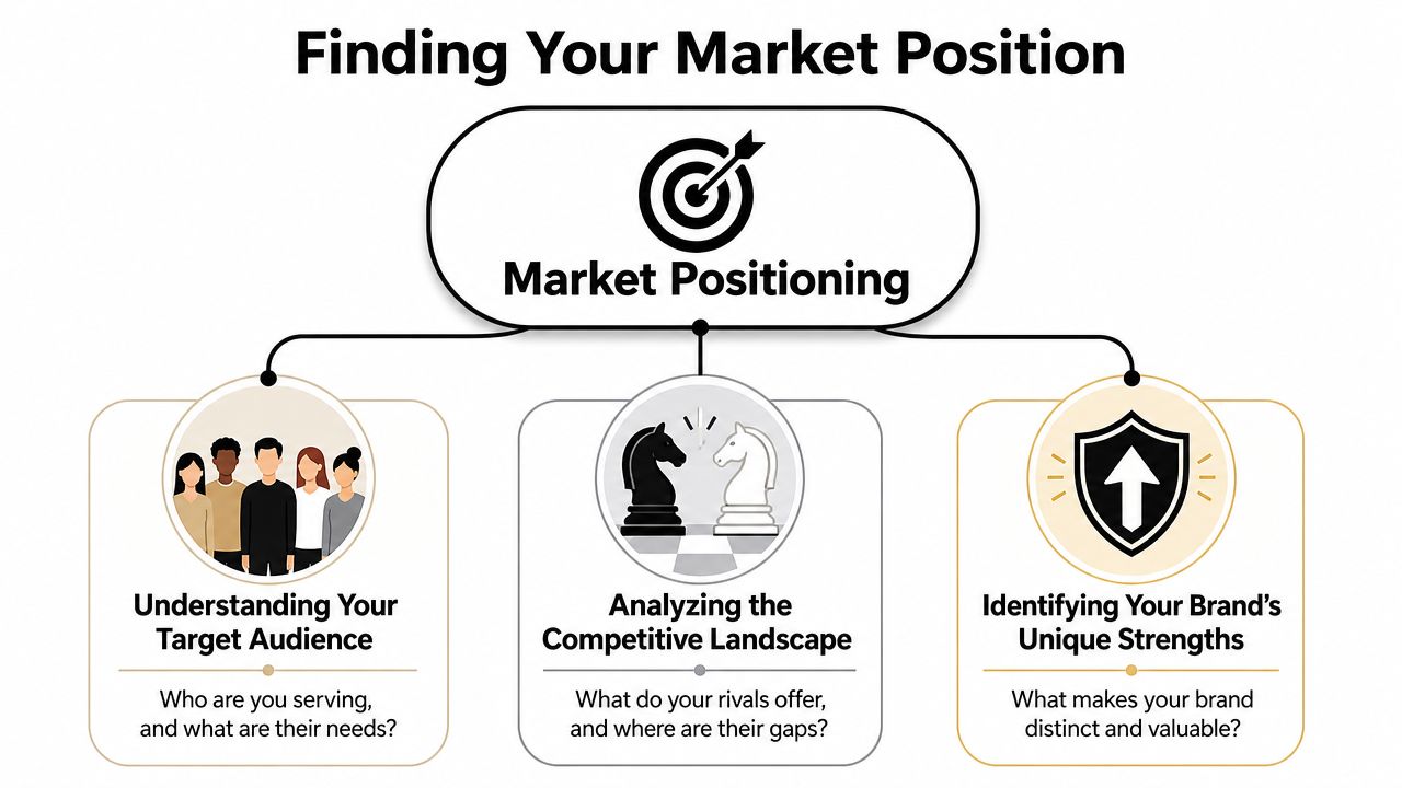
A technically sound workflow starts with three evidence sources: key stakeholders, the company itself, and the competitive set. Then you filter what you learn into insights that are relevant, differentiated, and authentic, as outlined in Sarah Robb O'Hagan's brand strategy process guide. That filter matters because it stops you from confusing “popular in the category” with “right for your brand.”
Start with buyer motives, not personas
Demographic personas are usually filler. They tell you someone is a founder, parent, or freelancer. They don't tell you why they buy now.
Use a jobs-to-be-done interview structure instead:
Trigger event
Ask what changed. What happened right before they started looking for a solution?Desired progress
Ask what outcome they wanted in plain language. Faster setup, fewer mistakes, stronger credibility, less stress.Anxieties and friction
Ask what nearly stopped them. Price confusion, fear of picking wrong, setup complexity, lack of trust.Decision criteria
Ask what they compared. Features, reviews, speed, design quality, founder credibility, onboarding.Success definition
Ask what “this worked” looked like after purchase.
You don't need a lab for this. For a lean internet business, interview recent customers, email past leads who didn't buy, read product reviews in your category, and scrape language from Reddit, YouTube comments, Amazon reviews, and support tickets. Your positioning should sound like the buyer's internal monologue, not your pitch deck.
Map competitors like a strategist, not a fan
Competitor analysis isn't about admiring other brands. It's about spotting patterns you can exploit.
Build a simple spreadsheet with these columns:
- Who they target
- Primary promise
- Tone of voice
- Visual style
- Pricing posture
- Proof they use
- What they ignore
The last column is where the money is. Most categories cluster around the same claims. Faster. Easier. Better quality. Smarter technology. That creates an opening for a brand with a clearer stance.
For example, if every tool in your niche screams automation, you might win by positioning around control, clarity, or craft. If everyone talks to experts, you might own the beginner category without sounding dumbed down.
A good position usually has three parts:
- Specific audience
- Specific transformation
- Specific reason to believe
If you can't state all three in one sentence, keep working.
Don't try to be distinct by being weird. Be distinct by being useful in a way your category isn't expressing clearly.
A short positioning draft might look like this:
“For solo e-commerce founders who are drowning in inconsistent creative, we provide a lightweight brand system that makes every customer touchpoint look credible without hiring an agency.”
That's rough, but it's sharper than “We help businesses grow through creative branding solutions.”
A related business decision sits underneath positioning. Your price tells the market how to interpret your brand. If your positioning promises premium trust but your pricing feels random, buyers hesitate. This guide on how to price anything is worth reading while you shape your offer because pricing and brand perception are tightly linked.
A quick visual overview helps when you're sorting these decisions:
Vet your brand name before you get attached
Founders waste days brainstorming names and five minutes validating them. Reverse that.
Use this checklist before you commit:
- Check domain reality: Look for a workable domain you can live with. Exact-match isn't always necessary, but a messy domain creates friction.
- Check social consistency: You want handles that are close enough to your brand name across the platforms you'll use.
- Say it out loud: If people can't spell it after hearing it once, you'll leak attention.
- Run a basic trademark search: Use free public trademark databases in your market to catch obvious conflicts early.
- Test memorability: Text five people the name, wait a day, then ask what they remember.
- Check category confusion: If the name sounds like three competitors, scrap it.
Naming should serve positioning. A decent name with a sharp brand wins. A clever name with muddy positioning doesn't.
Define Your Brand's Verbal Identity
Once your position is clear, turn it into language people can recognize. Here, most brands either come alive or become corporate wallpaper.
Your verbal identity includes your name, tagline, promise, messaging pillars, brand story, and tone. It's the system that makes your homepage, product page, checkout flow, support email, and Instagram caption sound like the same company.
The fastest way to make this useful is to stop trying to sound “professional.” Professional often means vague. You want clear, specific, and consistent.
Choose a naming style you can actually defend
Not all names do the same job. Some explain. Some evoke. Some create room to grow. Pick based on your strategy, not your ego.
| Type | Description | Pros | Cons | Example |
|---|---|---|---|---|
| Descriptive | Says what the business does directly | Clear, easy to understand | Harder to protect, can feel generic | Payroll Pilot |
| Evocative | Suggests a feeling, outcome, or category idea | More memorable, more flexible | Needs stronger messaging support | Northbeam |
| Invented | Made-up or altered word | More ownable, distinct | Needs explanation, may be less intuitive | Velora |
| Founder-led | Built around a person's name | Strong for personal brands and expertise businesses | Harder to separate founder from company | McCallister Media |
| Compound | Combines two real words | Can balance clarity and uniqueness | Easy to overcomplicate | TaskForge |
For most solo founders, I like evocative or compound names. They're easier to remember than sterile descriptive names and easier to launch than abstract invented words.
Build messaging around one sharp idea
A brand without a point of view becomes content sludge. Strong brands need a perspective drawn from the founder, audience, and market, and the most memorable angles aren't just factual claims. They're ideas people can debate and remember, as argued in Valchanova's guide to remarkable content angles.
That's where your verbal identity gets teeth.
Ask yourself:
- What does my audience believe that keeps them stuck?
- What do competitors keep repeating that I reject?
- What idea do I want associated with my brand every time people mention it?
If you sell a simple analytics tool, your angle might be, “Most dashboards create fake confidence. Decision-ready metrics should fit on one screen.” If you sell premium coffee gear, it might be, “Home brewing doesn't need more features. It needs less friction.”
That angle should shape your brand story, not sit in a strategy doc.
Your story isn't your origin tale. It's the explanation buyers use when they recommend you to someone else.
Define voice with rules, not adjectives alone
A lot of founders write “bold, witty, trustworthy” and think they have a voice guide. They don't. Those are labels, not instructions.
Write voice rules like this:
We say: Clear outcomes in plain English
We avoid: Inflated claims and startup clichésWe sound like: An experienced operator who has done this before
Not like: A hype-driven marketer chasing trendsWe prioritize: Specificity, directness, practical proof
We cut: Filler, jargon, motivational fluff
If you need help separating emotional feel from execution, this breakdown of tone vs mood helps because founders often confuse the atmosphere of a brand with the actual language choices that create it.
Create three messaging pillars
Don't build a giant messaging house. You need three repeatable ideas.
For a fictional e-commerce brand selling premium desk accessories, the pillars could be:
Designed for focused work
Every product supports a cleaner, calmer workspace.Built to last
Materials, finish, and function matter more than novelty.Understated premium
No flashy gimmicks. Just useful objects that look good every day.
Now every piece of copy has a job. Homepage headline, product descriptions, packaging inserts, and welcome emails all reinforce the same core ideas.
That verbal system also informs your visual identity. If the brand voice is calm, direct, and premium, the visual system shouldn't scream with neon gradients and five display fonts. In practice, that means your logo, color palette, font pairings, and image treatment need to support the same promise across a website, social posts, and packaging. For that desk brand, you'd use restrained colors, readable typography, and packaging that feels deliberate rather than loud.
Develop a Memorable Visual Identity
You open your site, your X profile, your checkout page, and your welcome email. Each one looks like it belongs to a different company. Buyers notice that faster than founders do.
That inconsistency kills trust. A visual identity needs to make your brand look recognizable everywhere a customer touches it, especially when you are a solo founder shipping fast with limited time and budget. If the brand only looks good in a polished homepage mockup, you do not have a real system yet.
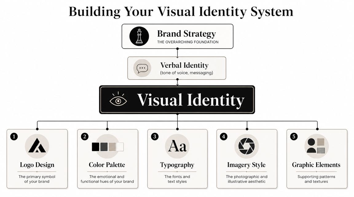
For an internet brand, the job is simple. Build a visual system that survives repetition. Your landing page, product UI, social graphics, emails, checkout flow, and invoices should all feel related. That is how a small brand starts looking bigger than it is.
Build the minimum viable brand kit
Do not start with a bloated brand book or a pricey agency sprint. Start with the smallest visual kit that lets you publish consistently for the next six months.
Here's the kit I use for new SaaS products and lean ecommerce brands:
- Primary logo: Wordmark for your site header and core brand uses
- Secondary logo: Compact version for narrow spaces
- Icon or mark: Favicon, app icon, social avatar
- Primary colors: One main color, one accent, two or three neutrals
- Typography pair: One heading font, one body font
- UI rules: Button shape, corner radius, border style, shadow style
- Image treatment: Screenshot framing, photo direction, illustration style
- Basic templates: Social post, email header, deck slide, promo graphic
That is enough. More than that usually turns into procrastination.
Use tools that match your stage. Figma gives you control. Canva gives you speed. AI logo tools can help with early direction, but the output usually needs cleanup before it is ready for real use. If you want a practical breakdown of what to use and what to skip, this guide on tools for modernizing your company logo is a useful starting point.
Choose visual rules that scale
Founders waste time chasing originality in the wrong places. You do not need a weird logo. You need recognizable decisions repeated on purpose.
Start with these rules:
- Pick colors that work in UI, not just on a moodboard
- Choose fonts built for screens, not trendy display faces that hurt readability
- Set one screenshot style and use it everywhere
- Limit accents so CTAs stand out
- Define spacing and border radius once, then keep it fixed
This matters even more for a solo founder because you will be producing assets yourself. A tight system lowers decision fatigue. It also makes every new asset faster to create, which is the main advantage.
A simple SaaS example
Say you're launching a creator analytics tool called “Northframe.”
The site uses an off-white background, charcoal headlines, muted blue as the primary color, and one warm accent for buttons and highlights. Headings use a clean sans serif with weight. Body text stays plain and readable. Every product screenshot uses the same rounded frame, shadow, and annotation pattern.
Now apply that same system to onboarding emails, feature launch posts, and your help center. The logo placement stays consistent. Buttons keep the same shape and color. Product visuals follow the same screenshot treatment every time.
That repetition is what makes the brand memorable.
Create a one-page style guide
Skip the giant PDF. A one-page guide is enough if it gives clear rules that another person can follow without asking you twenty questions.
Include:
- Logo usage: Primary, secondary, icon, clear space, minimum size
- Colors: Hex codes and where each color should appear
- Typography: Fonts, weights, and size hierarchy
- UI components: Buttons, form fields, cards, links
- Imagery: Screenshot rules, photography direction, icon style
- Copy reminders: Three short voice rules pulled from your verbal identity
This document is not busywork. It protects the brand when you hire a freelancer, add a VA, or move faster than your memory can handle.
The goal is not to look expensive. The goal is to look consistent enough that buyers remember you after the tenth impression, not just the first.
Create Your Go-to-Market Brand Assets
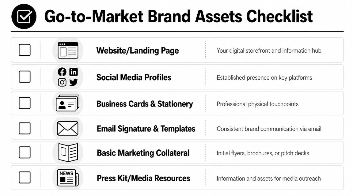
You don't need every asset on day one. You need the ones that buyers touch.
Most founders overbuild the brand package and underbuild the launch package. They spend days tweaking moodboards, then launch with a weak homepage, mismatched social profiles, and no email sequence. That's the wrong order.
Ship the assets that create trust first
For a lean online business, these are the first assets that matter:
- Homepage hero: Clear promise, clear audience, clear next step
- About page: Founder credibility, philosophy, and reason this brand exists
- Social profiles: Matching avatar, header, bio, and pinned post
- Email signature: Clean identity, proper role, site link, optional CTA
- Email template: Welcome email, launch announcement, and follow-up
- Sales or pitch deck: If you sell B2B, partnerships, or higher-ticket services
- Packaging insert: If you sell physical products, add a branded thank-you or care card
If you sell physical goods, branded touchpoints can extend beyond the screen. Done well, they reinforce memory and make the brand feel more deliberate. For founders considering offline support materials, this guide to maximizing ROI with promotional products is useful because it focuses on selecting branded items with practical business use instead of random swag.
Build for real users, not your idealized customer
A lot of branding advice ignores usability. That's a mistake, especially if you serve an underserved demographic or a mixed audience with different needs.
Guidance on designing for underserved demographics emphasizes researching unmet needs, working directly with target users, tailoring experiences to habits and context, and building accessibility into the product from the start rather than as an afterthought, as discussed in Domain.me's guide to designing for underserved demographics.
That changes brand execution in practical ways:
- Use accessible contrast: Don't pick elegant colors that make text harder to read.
- Write for scanning: Short paragraphs, clear buttons, obvious hierarchy.
- Respect device context: Your buyer might discover you on mobile and purchase later on desktop.
- Reduce friction: Forms, checkout, onboarding, and support are brand touchpoints too.
A brand that looks premium but feels annoying loses trust fast.
Use a 90-day launch asset plan
Don't try to perfect everything before launch. Roll assets out in phases.
Days 1 to 30
- Launch homepage, about page, social profiles, email signature
- Publish one pinned social post that explains your angle
- Send a launch or reintroduction email
- Create one reusable Canva or Figma template for social content
Days 31 to 60
- Add FAQ page, customer proof section, and one lead magnet or welcome sequence
- Tighten product page visuals and standardize thumbnails
- Build a simple press kit or founder bio page
Days 61 to 90
- Refresh top-performing assets based on feedback
- Add partner or affiliate assets if relevant
- Improve onboarding emails, packaging inserts, or post-purchase touchpoints
The point isn't volume. It's coherence. Every new asset should make the brand easier to recognize and easier to trust.
Launch, Measure, and Refine Your Brand
A brand launch isn't a reveal. It's a test.
Most founders treat launch day like the finish line. They update the site, post on social, send one email, then move on. That wastes the most valuable part of the process, which is learning how the market responds.
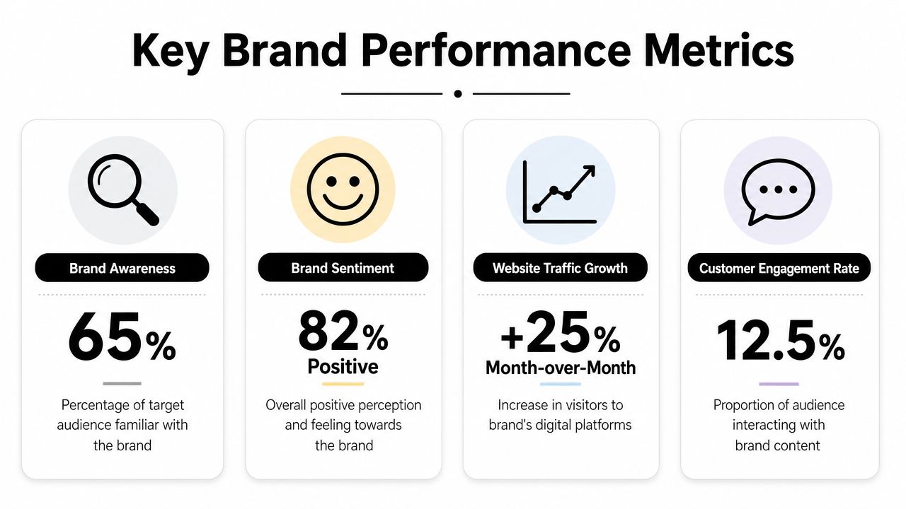
A data-driven brand program should be managed with explicit KPIs such as awareness, engagement, traffic, loyalty, and retention, then validated with ongoing brand tracking, social listening, customer feedback, and A/B testing. Experts also recommend NPS and brand-lift testing to measure whether brand activity changes behavior, according to Zen Agency's guide to building a brand that lasts.
Track the right signals
Don't obsess over vanity metrics. Look for signals that show whether your brand is becoming clearer and more trusted.
Start with these buckets:
Awareness
- Direct traffic trends
- Brand name searches
- Social mentions
- Referral traffic from podcasts, newsletters, or partner mentions
Engagement
- Time on key pages
- Email replies
- Saves, shares, and meaningful comments
- Demo requests or contact form quality
Trust and loyalty
- Customer reviews
- Repeat purchases
- Referral behavior
- NPS or simple “Would you recommend us?” surveys
Conversion quality
- Landing page conversion by traffic source
- Email click quality
- Trial-to-paid movement
- Sales call close quality if you sell services or software
You can collect a lot of this with simple tools. Google Analytics, Google Search Console, platform-native social analytics, email platform reports, and lightweight survey tools are enough for most solo founders. Google Alerts is useful for brand mentions. So are comment audits and inbox replies. If you want a broader mix of operating resources and tool research in one place, EntreResource publishes practical content for internet businesses across traffic, e-commerce, content, and software workflows.
Use a simple post-launch review cadence
You don't need a quarterly offsite. You need one recurring review.
Run this every two weeks for the first three months:
What did people repeat back to us?
Pull phrases from sales calls, support tickets, comments, and replies.Where did people hesitate?
Check bounce points, objection-heavy pages, and low-response content.Which asset created the strongest response?
Maybe it was your founder video, your homepage headline, or a product screenshot carousel.What felt off-brand in execution?
Look for inconsistency in visuals, voice, and offer framing.What one thing are we changing next?
Pick one meaningful adjustment. Don't rebrand every week.
Brand refinement usually means sharper wording, tighter visuals, and fewer mixed signals. It rarely means starting over.
Run low-cost tests that improve clarity
A/B testing matters most when you test interpretation, not just clicks.
Useful tests include:
- Homepage headline tests: Does one version make the audience feel more specifically understood?
- Offer framing tests: Does your value proposition land better around speed, confidence, or simplicity?
- Visual hierarchy tests: Do buyers notice the proof section before they bounce?
- Email voice tests: Does a direct operator-style tone get more replies than a polished marketing tone?
Social listening matters here too. Watch what language customers use when they describe you. If they keep describing your brand differently than you intended, the brand system needs tightening.
Know when to refine and when to hold steady
Founders change brands too fast. They get bored before the audience gets familiar.
Hold steady if:
- People are repeating your core idea accurately
- Conversion quality is improving
- New assets are staying visually and verbally consistent
Refine if:
- Traffic comes in but buyers misread the offer
- People remember the aesthetic but not the promise
- Different channels feel like different companies
- Your brand attracts the wrong customer segment repeatedly
The discipline is in not panicking. Brand recognition compounds through repetition. If you keep changing the name, palette, headline structure, or angle every month, you keep interrupting your own momentum.
A good brand gets clearer over time. It doesn't get louder.
If you want the shortest version of how to create a brand, it's this: pick a narrow audience, own a sharp promise, express it in recognizable language and visuals, launch the minimum asset set, then refine based on real feedback. That's the founder playbook. It's lean, scalable, and far more effective than pretending a logo is strategy.