

Want to actually increase your conversion rate? It’s not about finding some secret hack or throwing spaghetti at the wall to see what sticks. It's about developing a systematic process to figure out what your visitors really want and then systematically removing all the friction that’s stopping them from getting it.
This whole playbook is built on that one core idea.
Your 2026 Guide to Conversion Rate Optimization
If you're serious about boosting conversions, you need a repeatable system, not just a handful of one-off tactics. That system is called Conversion Rate Optimization (CRO). It’s the practice of methodically improving your site or app so more visitors take the action you want them to, whether that’s buying a product, signing up for your list, or starting a trial.
For any online business today, CRO is the engine that drives sustainable growth. It moves you from pure guesswork to making data-backed decisions that actually pay off. According to Adobe, companies that invested strategically in CRO were 50% more likely to see a significant increase in sales.
The whole thing boils down to a simple, continuous four-stage loop: Diagnose, Hypothesize, Test, and Analyze. This is the framework that helps you find the "why" behind what your users are doing and then act on it with precision.
Here’s a quick visual of this powerful little loop.
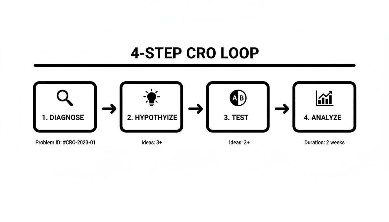
Following this process means every change you push live is deliberate and measurable. It’s how you create a cycle of constant improvement instead of just hoping for the best.
The Levers of Growth
So, where do you even start? While every business has its unique quirks, I've found that a few key areas almost always deliver the biggest wins. If you're looking for low-hanging fruit, focusing on user experience, your checkout flow, and trust signals are usually the best places to begin.
I've put together a table that breaks down the most common optimization areas and the kind of lift you can realistically expect from them.
Core CRO Levers and Their Potential Impact
This table gives you a snapshot of the high-impact areas for optimization and the typical uplift we see when entrepreneurs get them right.
| Optimization Area | Common Tactics | Potential Conversion Lift |
|---|---|---|
| User Experience (UX) | Simplify navigation, improve mobile design, boost page speed. | 5-20% |
| Copywriting & CTAs | Write benefit-driven headlines, create clear calls-to-action. | 10-50%+ |
| Trust & Social Proof | Add testimonials, security badges, and clear return policies. | 5-15% |
| Checkout & Forms | Reduce form fields, offer guest checkout, add payment options. | 15-90%+ |
Looking at that table, it’s clear that some of the biggest gains come from nailing the final steps of the customer journey, like the checkout process.
A study on payment methods drove this point home for me. It found that offering relevant local payment options can have an insane impact. For instance, offering BLIK to customers in Poland resulted in a 46% conversion increase, and adding Alipay for users in China boosted conversions by an incredible 91%, according to a report by Rapyd.
This data teaches a crucial lesson: CRO isn't just about tweaking button colors. It’s about deeply understanding and meeting your customer's expectations at every single turn.
While the principles in this guide apply to most online businesses, platform-specific strategies are also critical. For a different perspective, you can explore how to improve your Amazon conversion rate with a profit-first strategy to see how these ideas adapt to a specific marketplace.
Think of this guide as your strategic roadmap. In the sections ahead, we’re going to dive deep into each stage of that CRO loop, giving you actionable tactics to diagnose problems and run tests that drive real results for your business.
Diagnosing Your Conversion Funnel for Hidden Opportunities
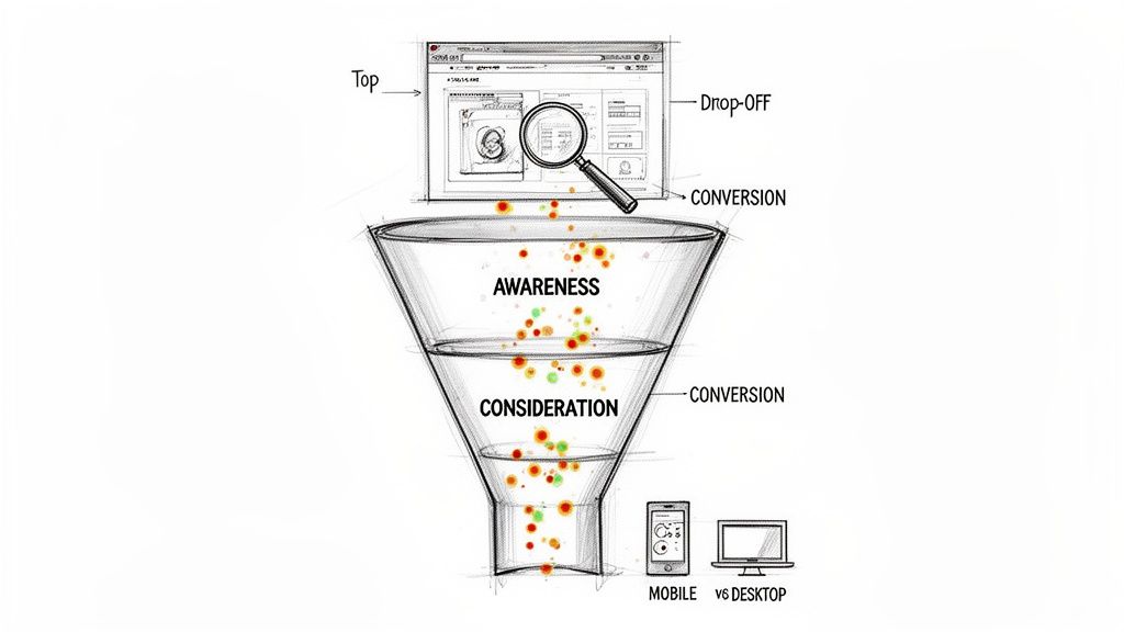
You can't just guess your way to a higher conversion rate. Before you can fix what's broken, you have to become a data detective and figure out what the problem actually is. This means looking past simple metrics like page views and digging into the user journey to find exactly where people are getting stuck.
Your main tool for this investigation is the conversion funnel. A funnel simply visualizes the path a visitor takes to complete a goal, like buying a product. When you set one up in a tool like Google Analytics, you can pinpoint where the biggest drop-offs are happening. According to the Baymard Institute, the average cart abandonment rate is nearly 70%, highlighting just how critical funnel analysis is.
For instance, you might find that 90% of users who add an item to their cart make it to the checkout page. That's great! But then, only 40% of those users finish the purchase. Right away, you know the problem isn't on your product pages—it's somewhere in your checkout flow.
Go Beyond Numbers with Qualitative Insights
Analytics tell you what is happening, but they almost never tell you why. To get the full story, you need to see your website through your customers' eyes. This is where qualitative tools like heatmaps and session recordings are absolute game-changers.
Heatmaps: Tools like Microsoft Clarity or Hotjar create visual overlays on your pages, showing you where people click, how far down they scroll, and where their mouse hovers. A heatmap might reveal that everyone is trying to click on a piece of text that isn't actually a link, which is a clear sign of a design problem.
Session Recordings: Think of these as anonymized video replays of what real people are doing on your site. You can literally watch someone struggle to find your shipping info, get frustrated with a confusing form, or run into a bug you never even knew you had.
One of the biggest "a-ha" moments I see entrepreneurs have is when they watch a session recording of a user on a mobile phone trying to fill out a long, complex form. Watching them pinch-and-zoom, make typos, and eventually just give up in frustration provides more actionable insight than a dozen analytics reports.
Watching just a few session recordings on pages with high drop-off rates can often uncover the most critical friction points in minutes. To dig deeper into setting up these powerful diagnostic tools, check out our guide on tracking and analytics for entrepreneurs.
Segment Your Data to Find Hidden Patterns
Not all visitors are created equal, and lumping them all into one big bucket can hide some of your most important insights. The final diagnostic step is to segment your data to compare how different groups of people behave. This helps you isolate problems that might only be affecting a specific slice of your audience.
Some of the most valuable segments you should be analyzing are:
Device Type: Compare your mobile vs. desktop users. If your conversion rate on mobile is tanking, it's a huge red flag. As of 2023, mobile devices generated over 60% of website traffic worldwide (Statista), so a poor mobile experience can be devastating.
Traffic Source: How do visitors from organic search vs. paid ads vs. social media compare? If traffic from a specific ad campaign is converting poorly, it probably means there's a disconnect between your ad copy and what they see on your landing page.
User Type: You absolutely need to differentiate between new vs. returning visitors. If returning visitors convert at a much higher rate, it might mean new visitors don't have enough trust or information to pull the trigger on their first visit. You could then test adding more social proof or a clearer value prop for those first-timers.
This diagnostic phase is the bedrock of any successful optimization campaign. By combining hard numbers from your funnel analysis, qualitative insights from user behavior, and smart audience segmentation, you shift from guessing to knowing. You'll end up with a clear, data-driven picture of what’s broken, which is exactly what you need to start building targeted, effective solutions.
From Detective to Scientist: Crafting Smart Hypotheses
So you've put on your detective hat and figured out where your funnel is leaking. Now it's time to switch gears. You're no longer just finding problems; you're becoming a scientist, forming educated guesses on how to plug those leaks.
This educated guess is your hypothesis, and it's the absolute bedrock of every single A/B test you’ll ever run.
A weak hypothesis is basically a shot in the dark, something like, "Maybe changing the button color will help?" A strong one, on the other hand, is a structured, testable statement that’s rooted in the data you just spent all that time collecting. It spells out exactly what you're changing, what you expect the result to be, and why you think it will happen.
This structure isn't just a "nice-to-have." It’s non-negotiable if you're serious about boosting your conversion rate. It forces you to draw a straight line from a potential solution to a real problem you observed in your users' behavior.
The Anatomy of a Powerful Hypothesis
A solid hypothesis always has three parts. I like to think of it as a simple formula you can lean on every time a test idea pops into your head. It makes sure every test is deliberate and that you can actually measure the outcome.
Here’s the formula I use, as recommended by conversion experts at CXL:
"By [Making This Change], we will cause [This Outcome] because of [This Reason]."
Let's run through a real-world scenario. Let's say your heatmap analysis from the last step showed that practically nobody is clicking the "Learn More" button on your pricing page.
- Weak Hypothesis: "Let's change the button text." (Useless.)
- Strong Hypothesis: "By changing the button text from 'Learn More' to 'See Plans and Pricing,' we will increase clicks to the checkout page because the new text is more specific and action-oriented, telling users exactly what they'll get."
See the difference? The second version is instantly a thousand times better. It's specific, has a clear metric for success (clicks to checkout), and is based on a sound reason you pulled from real user data.
A great hypothesis is a prediction, not a question. It turns your fuzzy ideas into a concrete experiment, which is absolutely critical for learning from your wins and your losses. When a test fails, a strong hypothesis helps you understand precisely why it failed.
Your next move is to start building a backlog of these structured hypotheses. This backlog will become your treasure map of potential conversion wins.
How to Prioritize Your Tests with the PIE Framework
Before you know it, you'll have more test ideas than you have time or traffic to run them. This is a great problem to have, but it can also lead to total paralysis. Trying to test everything at once is a surefire way to get chaotic, messy results.
This is where prioritization is a lifesaver. You need a simple, reliable way to decide what to tackle first. For this, I’m a big fan of the PIE framework: Potential, Importance, and Ease.
For every hypothesis in your backlog, you’ll score it from 1 to 10 on these three criteria:
- Potential: How big of an impact could this change really make? A test on a high-traffic page, like your homepage, has way more potential than a tiny tweak on your 'About Us' page.
- Importance: How valuable is the traffic to this specific page? Optimizing your final checkout page is far more important than your blog, simply because those visitors are seconds away from giving you their credit card details.
- Ease: How difficult will this test be to actually build and launch? Swapping out button text is a piece of cake (a 9 or 10), but a full redesign of your checkout flow is a massive undertaking (a 2 or 3).
Once you've scored each idea, just average them out: (P + I + E) / 3. The ideas with the highest PIE score shoot to the top of your testing roadmap. This simple system ensures you're always focusing your precious resources on the tests that are most likely to move the needle in a meaningful way.
Executing High-Impact A/B Tests That Actually Work
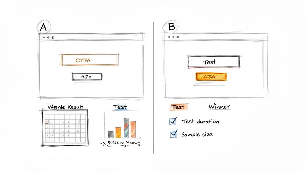
Alright, you've done the diagnostic work and have a solid, data-backed list of hypotheses. Now it's time to put that theory into practice. This is where we move from educated guesses to launching controlled experiments—A/B tests—to see if your changes actually move the needle in the real world. This isn't about throwing spaghetti at the wall; it's about scientifically proving what works for your business.
An A/B test, or split test, is pretty straightforward. You show two versions of a page to different segments of your traffic at the same time. The original is your "control" (version A), and your new masterpiece is the "variation" (version B). By tracking which version gets more conversions, you get a definitive answer on whether your hypothesis was on the money.
Setting Up and Running Your Test Correctly
First things first, you need a tool. There are plenty of options out there, like VWO or Optimizely. Even though Google Optimize is gone, the principles behind it are what matter. These platforms make it relatively painless to define your control page, build your variation, and set the goal you're aiming for, whether it's a button click or a full form submission.
Here's where so many entrepreneurs shoot themselves in the foot: calling a test too early. You might see your variation jump out to an early lead after a couple of days and get tempted to declare victory. Don't. You could be falling for a "false positive," where random chance makes one version look like a winner when it's not.
For your results to be trustworthy, you need to hit statistical significance. Think of this as a confidence score, which is typically set at 95%, that your results are legit and not just a fluke. You also need to let the test run long enough to smooth out any weird traffic patterns. A full week or two is a good rule of thumb to account for weekend vs. weekday behavior. You can use an online A/B test calculator to get a decent estimate of the sample size and time you'll need.
Essential On-Page Tactics That Move the Needle
While the test is the method, the tactics you're testing are what actually generate the lift. After running countless experiments, I've found a few on-page elements that consistently deliver outsized results when you get them right.
Compelling Copy and Value Proposition: Your words are your most powerful sales tool. Does your headline scream a clear benefit? Does your copy directly address your customer's biggest fears and frustrations? Always prioritize clarity over being clever. One famous study showed a 90% increase in clicks by simply changing a headline to be more specific.
High-Contrast, Action-Oriented CTAs: Your call-to-action button should be impossible to ignore. Pick a color that pops against the background. Even more important is the text on the button itself. Instead of a boring "Submit," try testing something that communicates value, like "Get Your Free Quote" or "Start My Trial."
Shifting from a generic to a specific CTA is one of the easiest and most impactful tests you can run. A VWO case study famously showed a 213% increase in clicks just by changing CTA button copy to be more relevant to the user.
To really dial this in, you can combine a killer CTA with a powerful page builder. For a closer look, check out our deep dive on using Thrive Suite for a conversion-focused WordPress site to see how the right tools can put your testing on overdrive.
Reducing Friction and Building Trust
Every extra step, every moment of confusion, is "friction" that absolutely murders conversions. Your main job is to pave a smooth, easy path from the moment a visitor lands on your site to the moment they take action.
Simplify Your Forms: Seriously, does your contact form really need ten different fields? Every single field you add increases the odds that someone will just give up and leave. A widely cited study by the marketing automation company HubSpot found that reducing form fields from four to three could increase conversions by 50%. Go through your forms field by field and be ruthless. Is this information absolutely essential right now?
Build Unshakeable Trust: People don't hand over their credit card info to websites that feel shady. You can build that critical trust in a few key ways:
- Social Proof: Plaster your site with testimonials, customer reviews, case studies, and logos of clients they'll recognize. According to BrightLocal, 79% of consumers trust online reviews as much as personal recommendations.
- Security Badges: Display secure payment logos (Visa, Mastercard, etc.) and SSL certificates, especially on checkout and payment pages. It's a small detail that provides a lot of reassurance.
- Clear Policies: Don't hide your privacy policy, return policy, or contact info. Making them easy to find shows you have nothing to hide.
These trust signals work by lowering a visitor's perceived risk. When they see that other people have had a positive experience and that their data is safe, they feel much more comfortable moving forward. Getting these elements in place isn't just a nice-to-have; it's a fundamental tactic for any business that's serious about how to increase conversion rate.
Using Personalization to Drive Significant Gains
A one-size-fits-all website just doesn't cut it anymore. If you're serious about boosting your conversion rate, you have to start tailoring the experience to the individual visitor. This is where personalization comes in, and thankfully, it's no longer a strategy reserved for mega-corporations with massive budgets.
Think of personalization as delivering relevance at scale. It can be as straightforward as showing a custom headline to visitors from a specific ad campaign, or as sophisticated as using AI to recommend products based on their browsing history. The end goal is to make every person feel like your site was built specifically for them.
When you get this right, the results can be pretty wild. Research from McKinsey shows that companies that excel at personalization generate 40% more revenue from those activities than average players. Another study by Segment found that 49% of buyers have made an impulse purchase after receiving a personalized experience. It's easy to see why it's the second most common CRO tactic out there today.
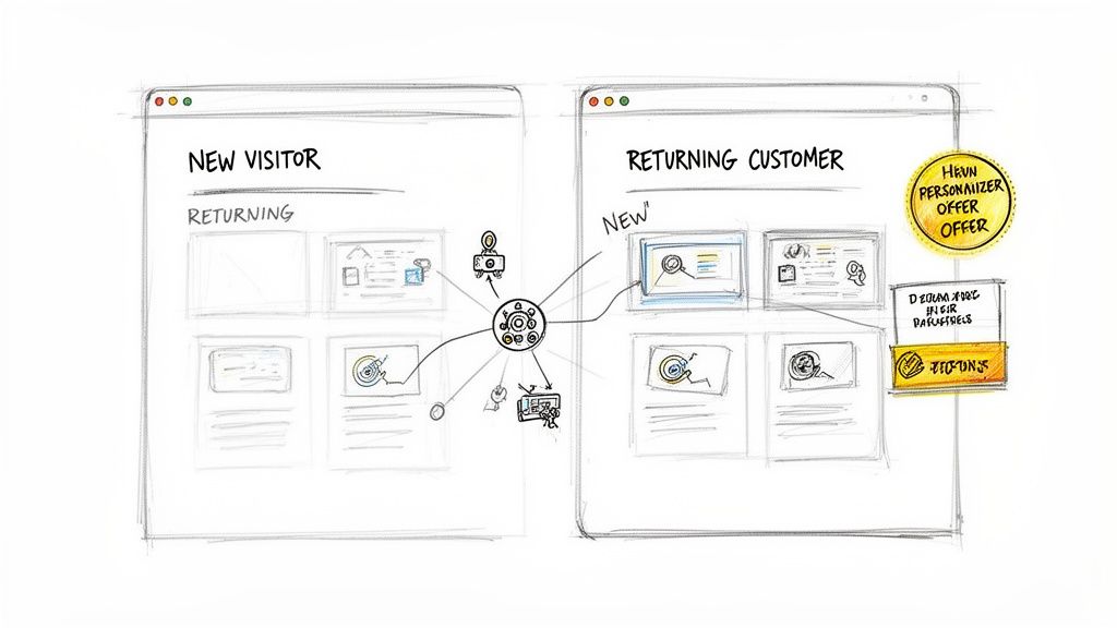
Segmenting Your Audience for Maximum Impact
Good personalization starts with smart audience segmentation. You have to group visitors based on shared traits so you can deliver a message that actually resonates. This isn't about creating thousands of unique experiences from day one; it's about starting with a few key segments that capture different user intentions.
Here are a few high-impact segments I always start with:
Traffic Source: Someone landing on your site from a Google search for "best budget laptop" is in a totally different headspace than someone who clicked a Facebook ad for a "high-performance gaming rig." Customize your landing page headline and hero image to match where they came from. It creates a seamless journey and reassures them they’re in the right spot.
Behavioral History: What have they done on your site before? You could show a simple "Welcome Back!" message to returning visitors or, even better, offer a special discount to someone who abandoned their cart last week. For loyal customers, you can stop showing them introductory offers and instead promote new products or your loyalty program.
Geographic Location: This one is a goldmine for e-commerce. You can display prices in the local currency, call out local shipping options, or even feature products that are popular in their city or country. It’s a small detail that makes a global business feel local and trustworthy.
Practical Personalization Tactics to Implement Now
You don't need a crazy-expensive tech stack to get moving on this. Lots of modern tools have built-in personalization features that are surprisingly easy to use. Here are a few ideas you can test pretty much right away.
Dynamic Text Replacement (DTR): This is a fantastic place to start. DTR lets you automatically swap out words on your page—like the main headline—to match the keywords a visitor used in a paid search ad. If they searched for "vegan protein powder," your headline can say "The Best-Tasting Vegan Protein Powder" instead of a generic "High-Quality Protein Supplements." It's a simple but powerful way to confirm intent.
Targeted Pop-ups and Offers: Instead of blasting the same newsletter signup form at everyone, get strategic. You can trigger different pop-ups based on who the user is and what they're doing.
- New Visitors: Offer a 10% discount on their first purchase in exchange for their email.
- Returning Visitors: Prompt them to check out your latest blog post or a new product line.
- Exit-Intent: Just as a visitor is about to leave a product page, hit them with a pop-up offering a limited-time deal for that specific item. According to OptiMonk, well-designed exit-intent pop-ups can convert between 2-4% of abandoning visitors.
Personalization is about more than just on-site tactics; it extends to your entire marketing ecosystem. A key part of this is tailoring your email communications. You can learn more about how to do this effectively by checking out our guide on how to send personalized mass emails.
By putting these targeted strategies into play, you start to transform your website from a static brochure into a dynamic conversion engine. You stop shouting one message at a crowd and start having individual conversations, which dramatically improves your odds of winning over each and every visitor.
Answering Your Top CRO Questions
As you get into conversion rate optimization, you'll find the same few questions pop up again and again. I've seen countless entrepreneurs get stuck on these, so let's clear the air and tackle them head-on. Getting these right from the start will save you a ton of headaches down the road.
What Is a Good Conversion Rate to Aim For
Honestly, there's no magic number. People love to throw around averages like 2-3%, but that figure can be totally meaningless depending on your industry, traffic source, and what you’re selling. For context, WordStream analyzed thousands of accounts and found that the average landing page conversion rate across industries was about 2.35%, but the top 25% of accounts converted at 5.31% or higher.
The only number that truly matters is your own. First, figure out your baseline conversion rate. After that, a "good" rate is simply one that's better than last month's. Your goal is to create upward momentum that drives real, profitable growth.
Use industry benchmarks as a loose guidepost, not a rigid target. The most important objective is to consistently beat your own records and build momentum.
How Long Should I Run an A/B Test
This really comes down to two things: your website traffic and hitting statistical significance. Most optimizers won't call a test valid until it hits a 95% confidence level. One of the biggest rookie mistakes is calling a test early just because one version pulls ahead after a couple of days. That's a great way to make bad decisions.
You need to let a test run for at least one full business cycle—that’s usually one or two weeks. This helps smooth out any weird fluctuations in how people behave on a Tuesday versus a Saturday. If you're unsure, just use an online A/B test duration calculator. It’ll give you a solid estimate based on your site’s traffic and current conversion rate.
Can I Do CRO Without Expensive Tools
Yes, absolutely. In fact, I recommend it. You can build a surprisingly powerful toolkit for free to get started and prove that CRO actually works before you splash out on paid software. Remember, a smart methodology will always beat a pricey subscription.
Here’s a simple, free stack to get you going:
- Analytics: Google Analytics is the obvious starting point for tracking your funnels and seeing how users move through your site.
- User Behavior: Microsoft Clarity is a game-changer. It gives you heatmaps and session recordings for free, which is just incredible.
- A/B Testing: While many top-tier A/B testing tools are paid, some website platforms and plugins offer built-in testing features for free or as part of a basic plan.
Start with these, get some wins under your belt, and then you'll have the data to justify upgrading to more advanced platforms when the time is right.